Punch Color

Punch Color

Architectural color experts use a punch color adding pizzazz to a home and defining the features. On a traditional house it's typical to use one on the shutters and front door. A punch color is like the tie on a man’s suit—a punctuation mark that brings the whole look together. A suit looks different when you are wearing a club tie versus a Hawaiian tie, and just like with a suit, the punch color dictates how a home presents itself. Figure out who you're trying to attract and pick a color that creates the right tone to sell to that person, or just to please yourself. Make everyday more colorful!

A Path to Color for Homeowners

A Path to Color for Homeowners

For many reasons homeowners seek out our color expertise to design a custom color scheme for their home. Many have tried to go it alone, spending a lot of money on paint samples only to be left disheartened. Others have been researching and planning a renovation for years and bring with them references, idea books and folders full of inspiration. We have clients approach us for help because they have had hail damage on their roof and are replacing it—and so they figure it’s a perfect time to update the entire exterior. We also get calls from owners who are selling their home and want it to be in the best possible shape for putting it on the market. Likewise, we get calls from realtors who are trying to aid their clients with added curb appeal that will ensure increased attention and better sales.

For all of these reasons we are the right color consultant and color expert for the job. We work with folks from all over the country and so have developed a mail order system for homeowners to easily use in what could otherwise be a daunting process. We mail or email out a Color Kit that includes a questionnaire that gets to the bottom of what our clients are hoping to achieve with a new color scheme. It allows them to ask themselves questions about color and interiors and their surrounding environment—ultimately giving us great insight into what direction we should take in our design. Also included in the Kit is a guide on how to take photos of the home. These photos will then be used to mark up with color placements in order to give the painter an exact guide for where to paint each new color selection. 

When we receive a packet from a homeowner there are several steps we go through in designing a new color scheme for their home. We start with the questionnaire and any references they may have given us. There is a great deal of knowledge we bring to the thought process from our education and experience. This is a creative process that also involves intuition. We have documented a few steps in this process visually—from receiving a package to working with value studies and then finally studying and working with color samples. It is important for us to visualize a home in black and white first—without any preconceptions about where color should go. In this particular case, we had the benefit of working on a home that was completely painted in white. So we were able to start from scratch and do several value studies which give an idea where the darkest to lightest value should go. For example, the base and foundation of a home would look better if it was darker to emulate the feeling of being sturdy and grounding. The windows and porch might appear more inviting and open if they were in a lighter value. These are the kinds of ideas that our mind relays with neutral colored pencils in order to give us a general map of where color should go. After we have that in place we work with color. A great deal of this begins with the givens—whether it is directly from what the homeowner likes or dislikes or it could also stem from what material will be unchanged, be it a roof or a brick or stone. We take all these things into account. When we have a palette of colors that works for the home we then work in detail to make sure that every feature of the architecture is given attention and its appropriate color.

In the end, we want a home that our client is going to love coming home to everyday. It may not be in our particular taste or style, but it is perfect for that home and the people residing in it. Working with homeowners is a favorite part of our business and we’ve been doing it for decades. We have designed for every architectural style and for every kind of client in all parts of the country. We take great pride in our work because we know you do too.

Color in interior spaces

Color in interior spaces

A color expert can come to the rescue! Often in apartment communities, interior spaces are left in dark shadow with poor lighting and dark siding colors wrapped into them. Not only does this make for a fairly depressing experience every time a resident comes home but these halls can be just plain scary to some having to come and go at night. It can be particularly worrisome for women living in and using these uncomfortable spaces. We recommend painting the interior walls in a light color and the ceilings in an off-white—and up the wattage of your bulbs. This is not the place to save money. Eliminating this problem can directly translate into better showings for potential customers but just as importantly can increase retention because your tenants find coming home much more pleasant.

COLOR SELLS

COLOR SELLS

There is not a single product where color does not impact the purchasing power. The Denver Post article relays the issue of importance of color in sales specific to the brand Case Logic. In the article, color expert James Martin of The Color People provides insight into color trends and The Color Marketing Group's strategic tagline "Color sells. And the right color sells better!"

Color Trends and Multi-Family Marketing

Color Trends and Multi-Family Marketing

The multi-family industry across the whole country is in the midst of a color trend change. This change is taking place everywhere from fashion to products and housing. For the last fifteen years we have been influenced by colors with historic antecedents which are basically khaki based colors—earthy and muted. The current color trend is based on what is being called the Mid- Century Modern Revival. As architectural color consultants, we see this as atrend that is going to last for the coming decade.

The change comes from the renewed interest in the period from 1955 to 1965. The Mad Men tv series is the most obvious flag bearer for this genre. There is also a renewed interest in mid-century homes especially by the millennial generation as well as suburban boomers returning to the urban world. In our core cities almost all new multi-family housing is reflective of this period of architectural styles.

As a rule, millennials are the ones seriously drawn to all things Mid-Mod. So if you are trying to appeal to them and are looking for your communities to attract this generation through the next ten years it is going to be imperative that you plan now for these properties to offer a look and feel that appeals to them. And don’t forget the boomers—always hip to the latest thing— they're now looking to live in places reflective of “what’s going on.”

Translated into colors this means that we are going to be seeing things based on a gray-toned palette rather than khaki. And since vivid color is the new measure of looking current we are going to see a lot more use of unexpected color on buildings that herald the fact that the properties that use them are up to date. We are already seeing oranges and reds though these are already passé. As the public gets more and more sophisticated and 50s colors are more common the palette is going to change to turquoises, icy blues and cool yellows. What may be seen now as a bit outlandish will quickly be see as the norm.

As color trend experts we see our job as making sure your property looks up to date and on the front end of color trends throughout your whole eight-ten year paint cycle. This new color family will need accents because living in grays solely will never really be something that makes for an outstanding statement nor will it attract the millennial market. If, as a savvy marketer, you want to appeal to the young resident you will be wise to take the opportunity and really step out from your competitors before you find these other properties going bold and outshining yours. Never forget, it will be years before you can paint again. 

Q&A with Color Pioneer & Consultant, James Martin

Q&A with Color Pioneer & Consultant, James Martin

What/who inspired you to work in the field of color?
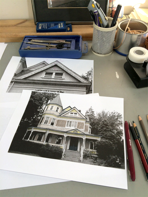
My degree was in graphic design and I remember when I was taking a photography class my professor was telling me that I was a real colorist after seeing my color photos. Of course, this was exactly the wrong thing I wanted to hear at the time since I was really into being an "arty" black and white photographer. I got into this when I was renovating Victorian Houses and looking to get back to art. I started doing it on the side and gradually built up the business.

Your website bio mentions the “colorist movement.” What exactly is that?
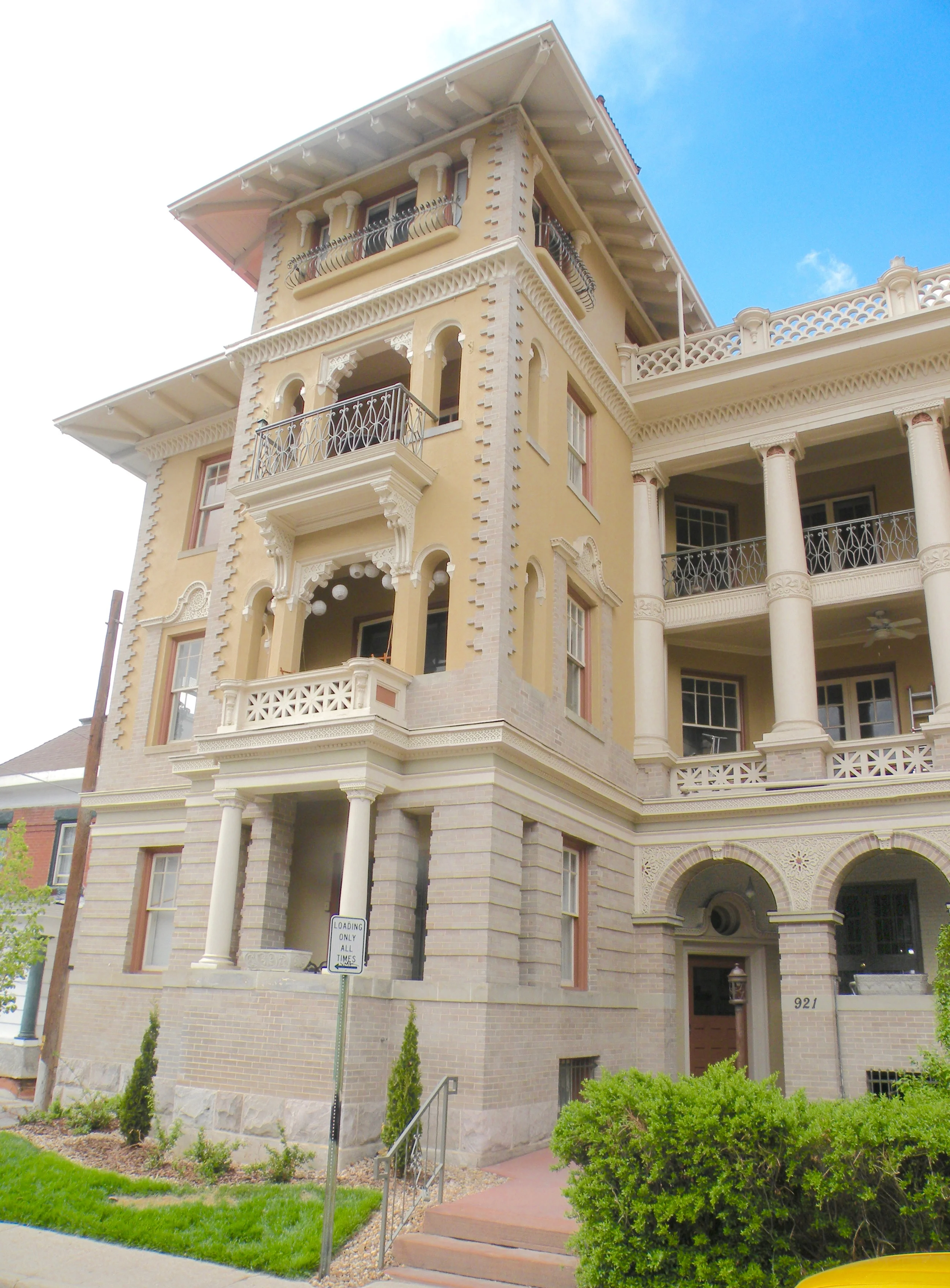
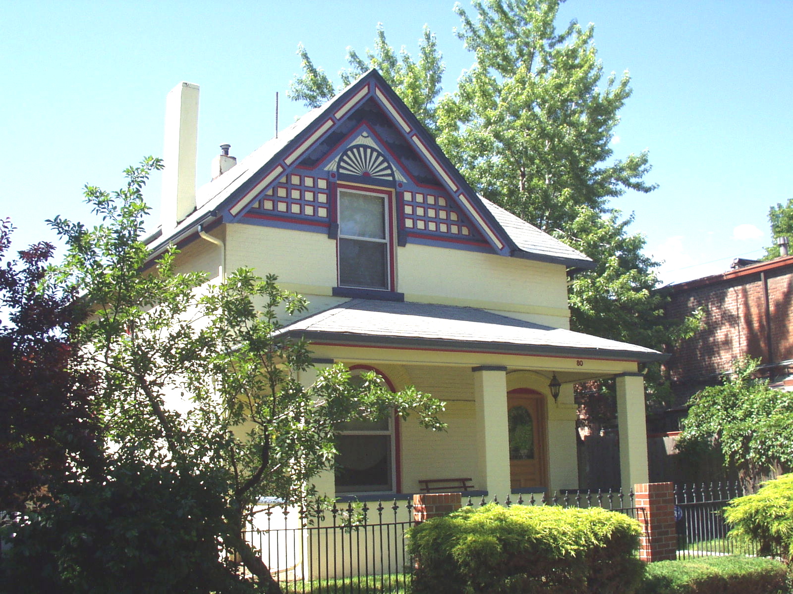
The Colorist movement really began with the Victorian "Painted Lady," a term coined by Michael Larsen and Elizabeth Pomada, who authored a number of books celebrating these homes. The movement spread by colorists from this genre branching out and doing lots of other types of buildings. It has really influenced architects who, enslaved by the Bauhaus ethic, rarely used color at all. Now you see them using it a lot even though rarely realizing the architectural potential color allows.

Regarding color in architecture, what’s the trend?
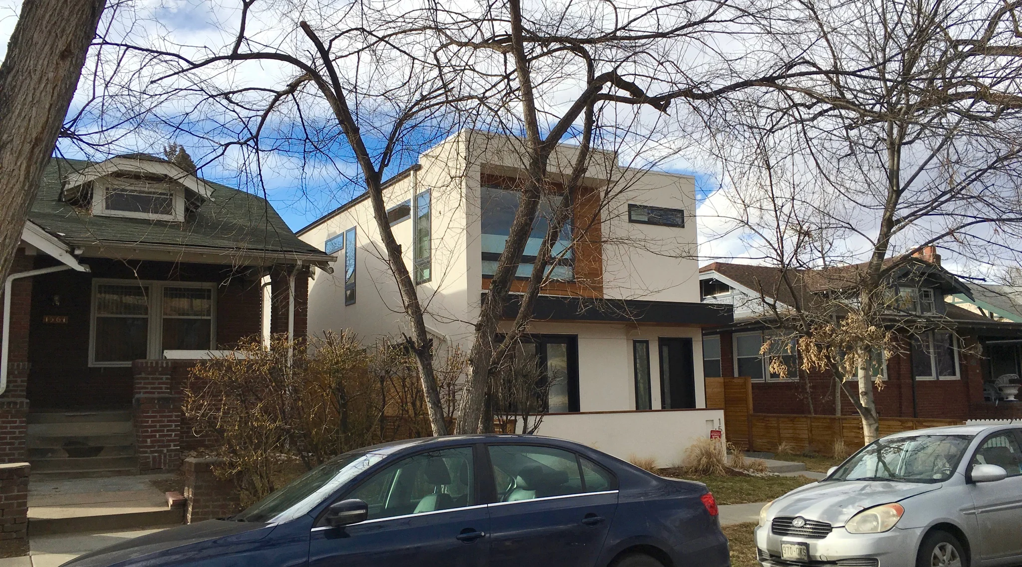
Color itself- all colors. To reference the above question, you see a lot of mid-century revival building which is updating the mid-century modern styles of the fifties and early sixties. Also there is a lot of color blocking which is using various colors and materials to break up the facade of a building. Echoing that period of time, colors are cleaner and less muddy.

What’s yesterday’s trend?
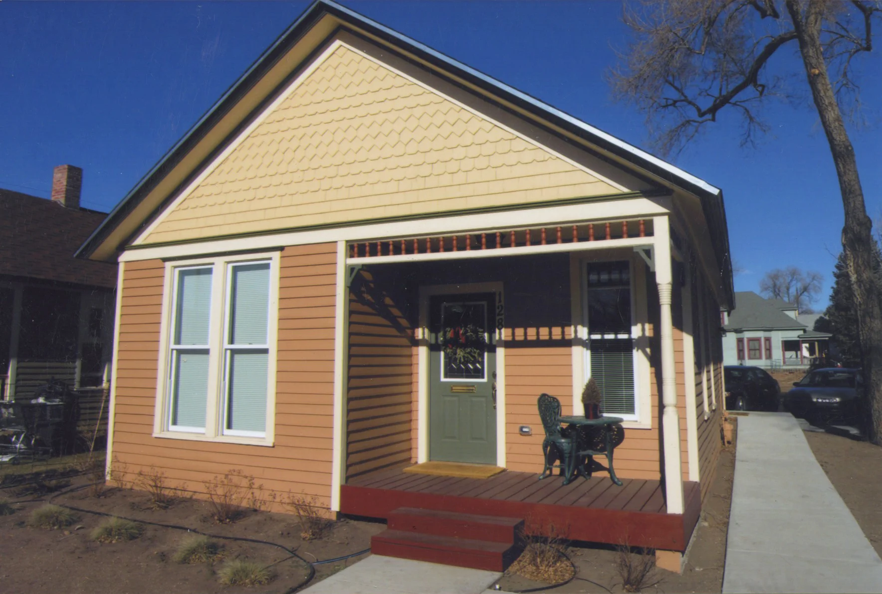
Colors from the Victorian and Arts and Crafts revivals. Muddy, Khaki influenced colors.

What color is your kitchen? 
Kind of greened yellow ochre. I really like colors that you can't fix on. You can't say, Oh, that's green!" I like colors that look different in different lights and on different days so that you would think instead of it being "green" you would not be sure if it was Khaki, or gray or yellow green. It just works and look terrific and makes your paintings look better as well as whatever else is in the room.

What is your greatest achievement in the field of color?
A few years ago just for a lark, I googled color consultants. I didn't even show up on the first page! I thought, "Wait a minute, what's up with this? I invented this gig!" I didn't know how google was structured but the point is that I really feel I helped create this blossoming of color consulting becoming a recognized profession in my small way.

What paint companies do you prefer?
I use all of them. I have my preferences but I don't want to broadcast them and seem to put other companies down. Really all paint pretty much does what it's supposed to do which is protect the substrate. The real differences are purely aesthetic.  

What are some simple tips for homeowners considering fresh paint—inside and outside? 
Number one is use warm colors- nobody likes a cold home. The key to making a home or room really work is the balance of trim and wall or body color.  High contrast between these keeps the room or home from feeling whole. A nice blend of the two colors makes all the difference. Also use a satin finish outside. The colors are richer, shed dirt more readily, and have a tougher finish than flat.

What are your sentiments on white? White walls?  
I ask my clients to take The Color People Pledge: "I will never use white again." White, especially your standard old white is inhospitable, lifeless and soul deadening. What's a shame is that architects who are rarely given any color training keep recreating this white business generation after generation. Mostly because color cannot be controlled and they want something that can be specified and come out exactly as they expect. Color is the most relative thing there is. It changes with finish, light, scale, what is next to it and just about everything else. That is the joy of color and what makes it so human.

What are the least obvious, yet most important places to consider in/on a home for color enhancements?
The more color you have, the more color you can use. If you have a room of very closely colored items it is extremely likely that most of what you add to it will not work. If a woman buys a khaki skirt and then tries to find a khaki jacket that goes with it she finds there are hundreds of shades of khaki and unless you get the right one it looks like you couldn't tell the difference. When you have colored walls and a colored couch you can have really different colors for the other objects in the room. Color really sets you free. And it makes your life much more enjoyable and satisfying as well.

COLOR WORDS TO LIVE BY: MAKING THE RIGHT STATEMENT

COLOR WORDS TO LIVE BY: MAKING THE RIGHT STATEMENT

A small house wants to make a small statement. A color consultant knows to avoid the temptation to make the house too busy. When a house has a lot of fretwork, often people want to paint every single little detail. The result makes those details look like they've been stuck on the house without any relationship to the rest of the building. When many elements vye for attention you lose the statement you want the house to make.

Infill: Part II

Infill: Part II

Watching this row house project start up, we were more than worried that it was going to be one more stacking design of rectangular blocks, defined by dark brick and color-blocked with spare stucco patches of charcoal, white and red—with perhaps some stained wood or corrugated metal thrown in. Being a turn-of-the-century neighborhood, there was a great deal of angst on the part of the neighbors.

But all our fears were unfounded. This is a brilliant example of sensitive infill housing. It doesn’t mimic historic buildings but does make liberal use of period detailing. It is clearly a new building and the interior is as fresh and spacious as any ‘modern’ home. The colors are also well chosen. We especially like the way the entry doors express that these row houses are brand new.

Urban Infill: Is it a problem?

Urban Infill: Is it a problem?

People are flocking back to the inner city. Infill housing, scrape-offs and total renovations are all the rage with developers wanting to cash in. Mid-Mod Revival is a popular style but unfortunately homebuyers with no sense of history of their new neighborhood—and lazy, copy-cat architects trying to make their "hip" statement—are destroying the visual fabric of older neighborhoods. That is where an expert architectural color consultant can help to select the colors that are right for that neighborhood.

“New modernism” homes are extremely livable and space-effective unlike many historic homes that surround them. We have no bones to pick with modern infill homes but there is absolutely no reason that they can’t use colors that allow them to blend with the streetscape. Today it seems like young architects can’t feel like their houses are cool unless they are bright white, black, charcoal and russet. Sadly it is as tedious as it is lacking in creativity. This example is a handsome home but simply changing the brash white to a tan would allow it to be a good neighbor. Good architecture will get noticed. It doesn’t have to scream, “Look at me!”

Retail Color Matters

Retail Color Matters

Caution Shopping Center Owners! You never want to get on the wrong end of a color trend. A local megastore chain painted its building mauve—right at the end of the mauve craze. Because the color trends changed, by the end of the first year of its re-opening, the store looked 10 years old. The point of paint in a mall-revival process is to make changes with color when you can’t—or don’t need to—undergo an architectural rehab. With the right paint you can turn your maintenance dollar into a marketing dollar. You can make a center look fresher, cleaner, more dynamic and dramatic—all with paint.

Color and curb appeal

Color and curb appeal

Everyone talks about curb appeal—so much so that builders tend not to take it seriously. But let’s look at the market. Costs of land and materials are so similar that your price per square foot is almost exactly the same as your competitors. You are both offering about the same number of rooms, similar room sizes and the same amenities. So all that you really have to offer to make your home stand apart is how it looks and more importantly how it feels.  The point is that emotion is perhaps more important than square footage. And the key to emotion is color.

What’s the new color trend?

What’s the new color trend?

The biggest trend in color is color itself. Today people are crazy for color. The Color Marketing Group, the international group that forecasts and tracks color trends, says “Color sells. And the right color sells better.” This is true today in every single product and market in the country. People don’t want the same old, same old. And a fresh look of color is much more desirable.