Infill: Part II

Infill: Part II

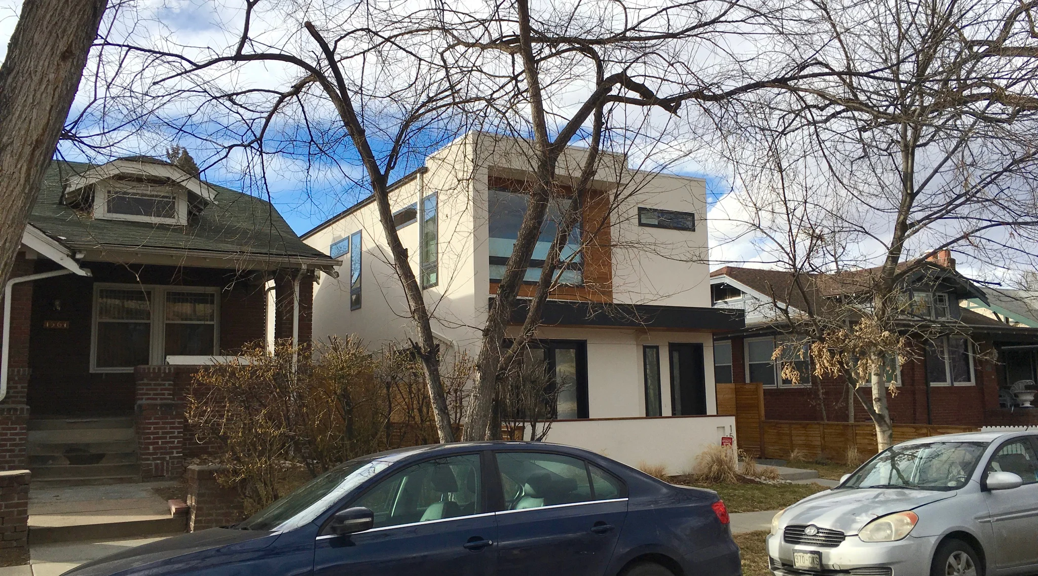
Watching this row house project start up, we were more than worried that it was going to be one more stacking design of rectangular blocks, defined by dark brick and color-blocked with spare stucco patches of charcoal, white and red—with perhaps some stained wood or corrugated metal thrown in. Being a turn-of-the-century neighborhood, there was a great deal of angst on the part of the neighbors.

But all our fears were unfounded. This is a brilliant example of sensitive infill housing. It doesn’t mimic historic buildings but does make liberal use of period detailing. It is clearly a new building and the interior is as fresh and spacious as any ‘modern’ home. The colors are also well chosen. We especially like the way the entry doors express that these row houses are brand new.

Urban Infill: Is it a problem?

Urban Infill: Is it a problem?

People are flocking back to the inner city. Infill housing, scrape-offs and total renovations are all the rage with developers wanting to cash in. Mid-Mod Revival is a popular style but unfortunately homebuyers with no sense of history of their new neighborhood—and lazy, copy-cat architects trying to make their "hip" statement—are destroying the visual fabric of older neighborhoods. That is where an expert architectural color consultant can help to select the colors that are right for that neighborhood.

“New modernism” homes are extremely livable and space-effective unlike many historic homes that surround them. We have no bones to pick with modern infill homes but there is absolutely no reason that they can’t use colors that allow them to blend with the streetscape. Today it seems like young architects can’t feel like their houses are cool unless they are bright white, black, charcoal and russet. Sadly it is as tedious as it is lacking in creativity. This example is a handsome home but simply changing the brash white to a tan would allow it to be a good neighbor. Good architecture will get noticed. It doesn’t have to scream, “Look at me!”

Retail Color Matters

Retail Color Matters

Caution Shopping Center Owners! You never want to get on the wrong end of a color trend. A local megastore chain painted its building mauve—right at the end of the mauve craze. Because the color trends changed, by the end of the first year of its re-opening, the store looked 10 years old. The point of paint in a mall-revival process is to make changes with color when you can’t—or don’t need to—undergo an architectural rehab. With the right paint you can turn your maintenance dollar into a marketing dollar. You can make a center look fresher, cleaner, more dynamic and dramatic—all with paint.

Color and curb appeal

Color and curb appeal

Everyone talks about curb appeal—so much so that builders tend not to take it seriously. But let’s look at the market. Costs of land and materials are so similar that your price per square foot is almost exactly the same as your competitors. You are both offering about the same number of rooms, similar room sizes and the same amenities. So all that you really have to offer to make your home stand apart is how it looks and more importantly how it feels.  The point is that emotion is perhaps more important than square footage. And the key to emotion is color.

What’s the new color trend?

What’s the new color trend?

The biggest trend in color is color itself. Today people are crazy for color. The Color Marketing Group, the international group that forecasts and tracks color trends, says “Color sells. And the right color sells better.” This is true today in every single product and market in the country. People don’t want the same old, same old. And a fresh look of color is much more desirable.