Viewing entries tagged
architectural consulting

HOT OFF THE PRESS!

HOT OFF THE PRESS!

We supply expert advice on exterior color to homeowners, business owners and property managers alike.  We also give our input on the process of consulting and how best to assist our clientele to those who are involved on the labor side of things, the painters and paint stores.

In this month's Paint and Decorating magazine, Melanie Moul writes about our conversation on the business of color and how best to aid those involved in the process of repainting in the article "An Expert Perspective on Color."  


Branding the Way We Live

Branding the Way We Live

We are seeing a heightened awareness from consumers about what they want in a product these days. Buyers desire a truly unique touch and reflection of their own personal tastes in everything—from food to clothing to the cars they drive.

This need for individualized experiences and personalized purchases bleeds into the crafted lifestyle concepts that we are seeing more of in single and multi-family housing.

The trend is toward designing, building and renovating buildings in a highly stylized way for all types of residents. There are themes branding the overall architecture, not to mention interior and exterior color. The community and family aspect is driving a branded and experiential development. 

Along with this more holistic and connected system is a great need for color. We are seeing color being tied to the entire community whether it's an apartment property or a new homebuilder project.

It's uniqueness that managers and developers are using to attract residents and that is where we, as color consultants, play an integral role. It is exciting to see this market driving the need for color and the use of color in more sophisticated applications.  We are your ambassadors for color and it is our goal to design successful and sustainable color schemes for all kinds of building exteriors.

Historic Color

Historic Color

At a time of the year where we are getting lots of calls from homeowners wanting to make the most of the painting season, we still hold a special place in our hearts for those who are managing historical renovations. These can be particularly challenging and extensive and most who are involved have been so for many many months, if not years.

We have been designing exterior color schemes for historical properties for over 30 years and we continue to be amazed at the architectural majesty of homes and businesses and commercial properties in historical districts all over the country.

We have been involved with historical color services in online and print publications to hopefully inform homeowners and give them as much information as possible to get them started and headed in the right direction. We also are listed as a resource for various media outlets. One of these is through the Preservation Directory. We know this to be a great platform for people involved in many parts of historical architecture and development and even for DIYers.

Check out the website Preservation Directory and find us in the listings for Preservation Businesses under Historic Color Services for Colorado. And have a happy and successful renovation season!

Making an Impact on Buyers

Making an Impact on Buyers

As with any project, shopping centers are multi-faceted in their approach to marketing. There is a similar concern for curb appeal as with any business or residential property interested in attracting buyers. We work hard at creating a design solution steered at making the right statement for property owners and feel that the use of color is the most effective way to do this within a budget. 

Retail needs to be a bit muscular. There needs to be a nuance to exterior color choice for these particular buildings and it will be absolutely critical to its success in drawing potential customers. Read more of our thoughts on “The Color Factor” in the retail environment in this article in Buildings magazine.

Here is an example of how a center’s monument sign gained new life as we packed some punch into its signage and allowed this marketing structure to make an impactful statement with color.

We have Doors!

We have Doors!

We have been strolling the neighborhood for signs of new growth. This is an area of great diversity and there are homes being renovated and parks being constructed. There are bike lanes being added and food trucks being converted into restaurants. It is busy! And that is great news for us business owners and in general, for those of us invested in this thriving cultural scene.

We blogged about the row homes we designed exterior schemes for and promised to update you with their progress. Well... WE HAVE DOORS! And dogs in the windows and all kinds of activity on the street front. It seems they have attracted a number of folks interested in living in the thick of the city and in the heart of a great art district as well. Our colors seem to be setting the right tone and appealing to a great community—and that was exactly our hope for this project.

Enjoy these updated images! 

Telling A Story

Telling A Story

When we begin the process of consulting with a homeowner on a new design scheme for their home's exterior, we look at their photos first—or in many cases, here locally—we visit them at their home so we can see it in person. Our clients are tasked with providing us with a visual story of their home—and they usually do a thorough job as it is something they look at and notice daily.

We try to really take in and imagine what this home looks like—both as a whole composition and also in its parts and pieces. The architecture reveals itself and therefore so does its story. This is the place where our design direction takes off.

The first thing we do is ask ourselves, "What is this house trying to say?" There is always a prominent message and our path to color is inherently grounded in this statement.

With this story in mind, we then investigate what the homeowner has relayed to us in their questionnaire. They have responded to questions on color, mood, surrounding environment and desirable degrees of detail. There are usually more clear responses about what people don't like and that can be just as helpful.

Our next step—the critical one and the true design challenge—is to take that initial story and translate our client's needs into that. Our goal is always to have our homeowner be happy everyday they come home—but we also are architectural color experts and ultimately hope to present the true message of what that house can be. It is a wonderfully unique and creative solution that is required and that we strive to provide for our clients—AND is the reason why our role is so important as Storyteller/Consultant/Designer.

Art Row in Progress

Art Row in Progress

We were hired by a developer to consult on the design and exterior color for a community of new row houses in our neighborhood. We work in a designated design district of Denver and love to be involved in local work affecting our area's unique character. It is a lively, culturally rich and artistic place and it was vital to relay this in our design solution for this housing project.

There were many different materials to coordinate and work with—including stone, siding, windows and roofing—so the overall concept needed to be cohesive with all of these selections. The placement of color was an important decision grounded in emphasizing the architecture of these buildings and also in making the right statement to its users.

We came up with selections in materials and a palette of colors that gave life to this unique community. Our intent was to create a perfect street and neighborhood presence and to be able to attract the right customer base for our client.

The project has been underway for several months and we have been excited to see it take shape. It has just reached the point of color sampling and now we are even more anxious to see it completed—and to watch as it takes off in this thriving market.

These photos give a sense of the process and some of the steps going on within this and other similar consulting projects for new developments. Continue to follow us on our blog and social media for more updates on this vibrant community.

Online Resource for Homeowners

Online Resource for Homeowners

We get calls and emails on a fairly consistent basis from homeowners who are looking for advice on specific painting issues—whether they are wondering what time of year to paint or attempting to paint an appropriate color sample on their home. We want to make sure each customer or DIY'er is armed with helpful information. A great resource we often reference ourselves is a website with a wealth of knowledge and practical advice—The House Painting Guide

The House Painting Guide is a valuable tool for researching information on painting your home—from learning about the painting process to specifics on the actual paints themselves. You can get started in your home renovation with the help of this website's tools and tips—and as they suggest, turn to expert color consultants—The Color People—for our added design expertise and experience in the field of exterior architectural color in order to complete the vision you have for your home.

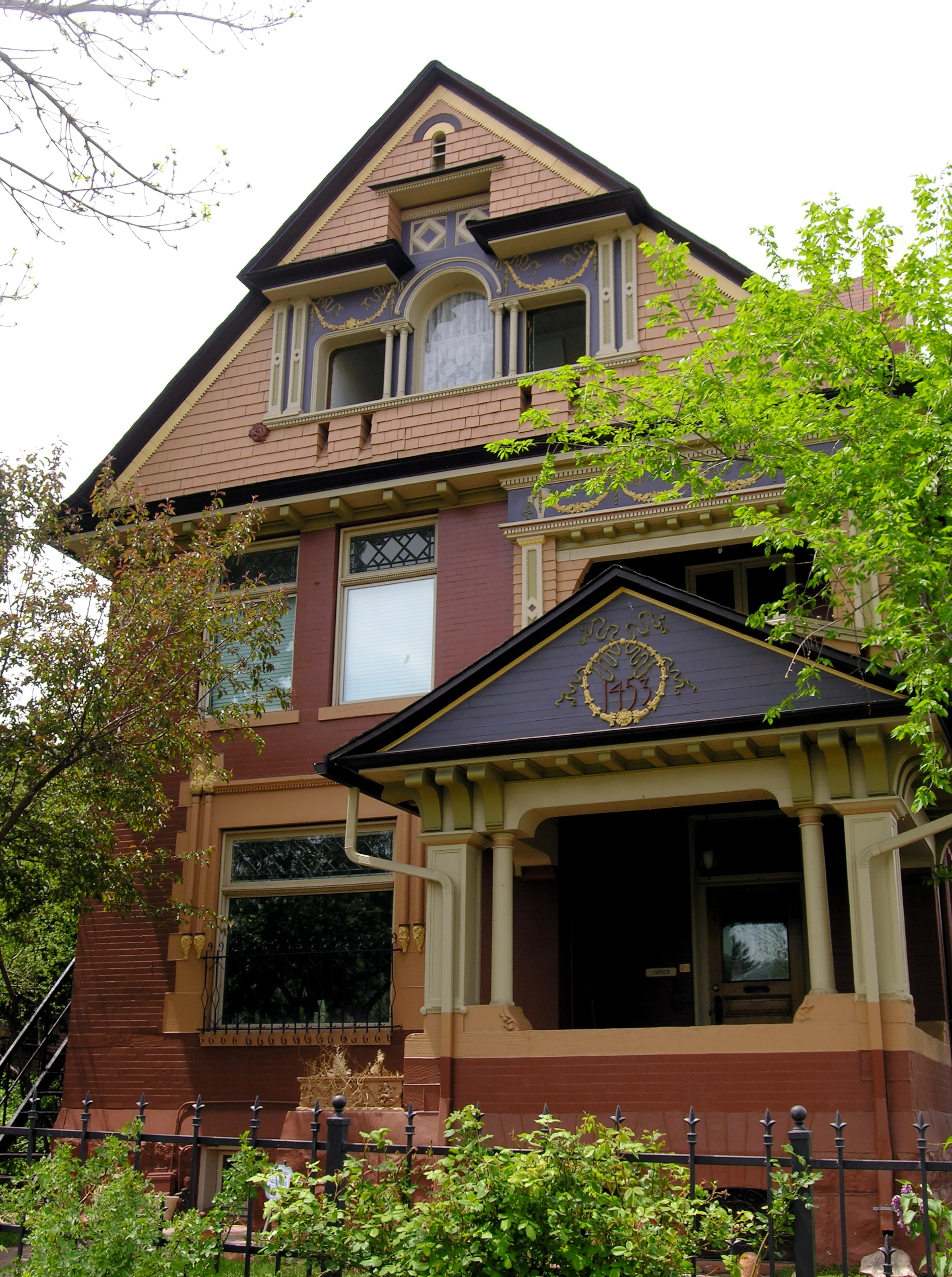
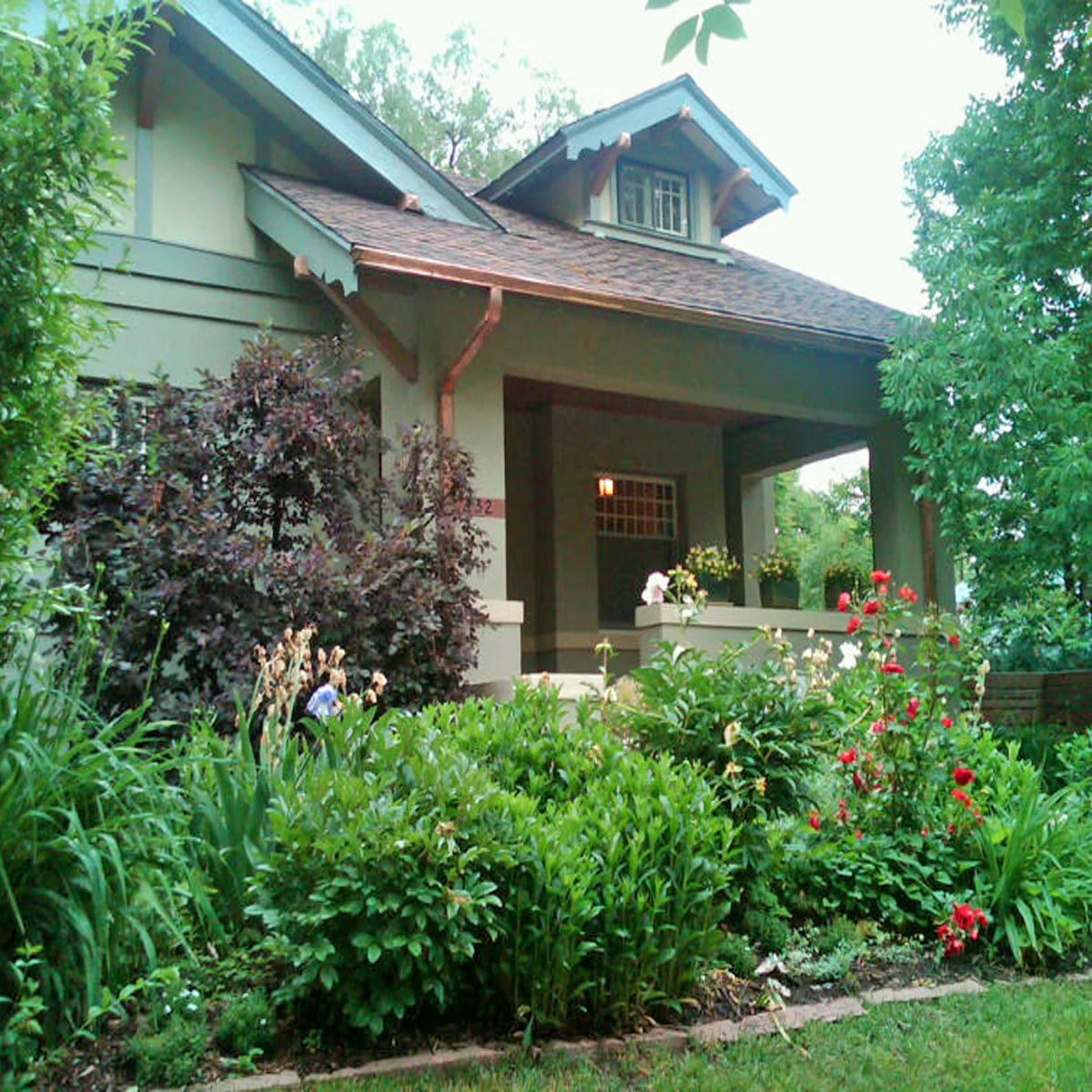
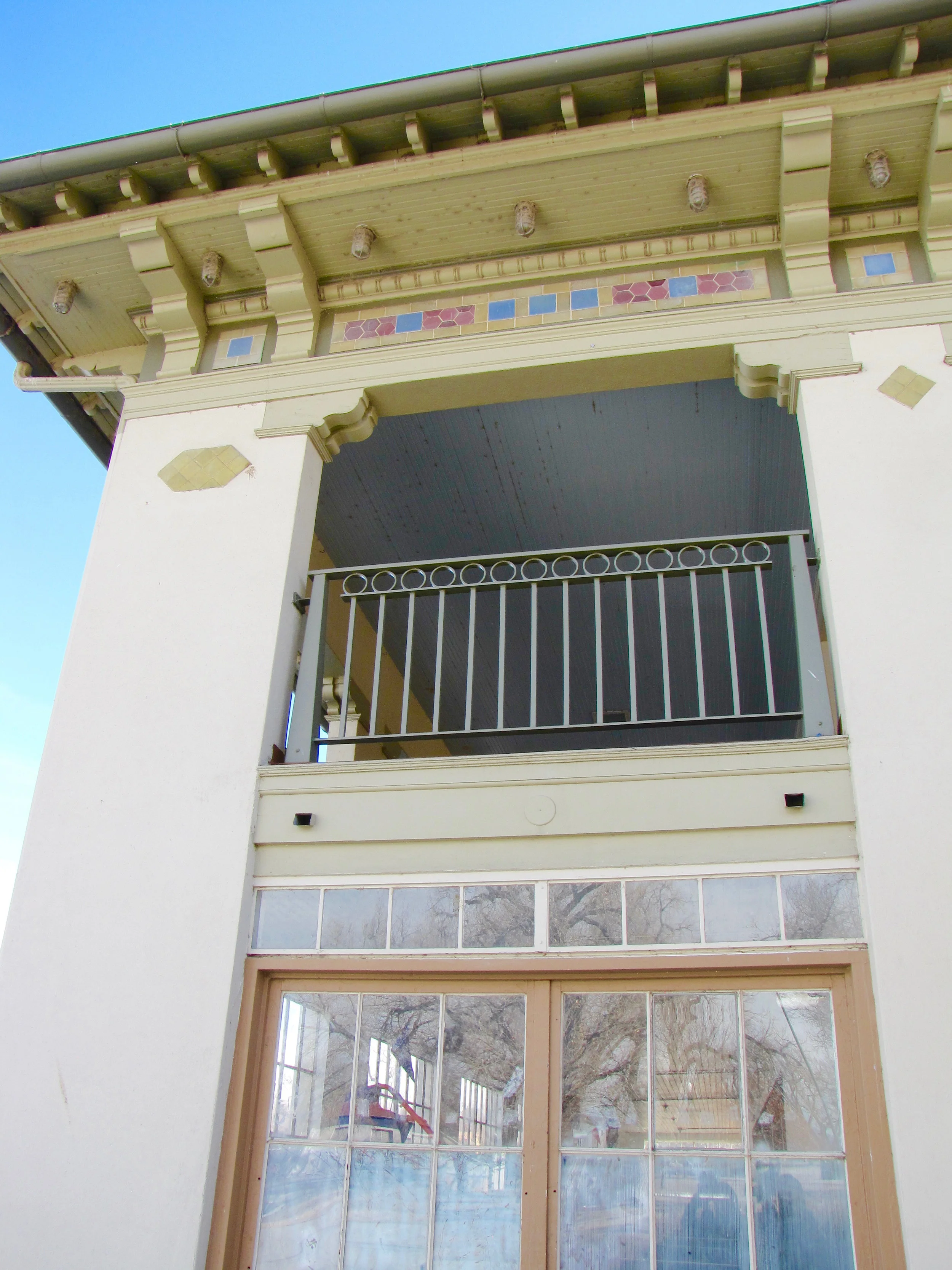
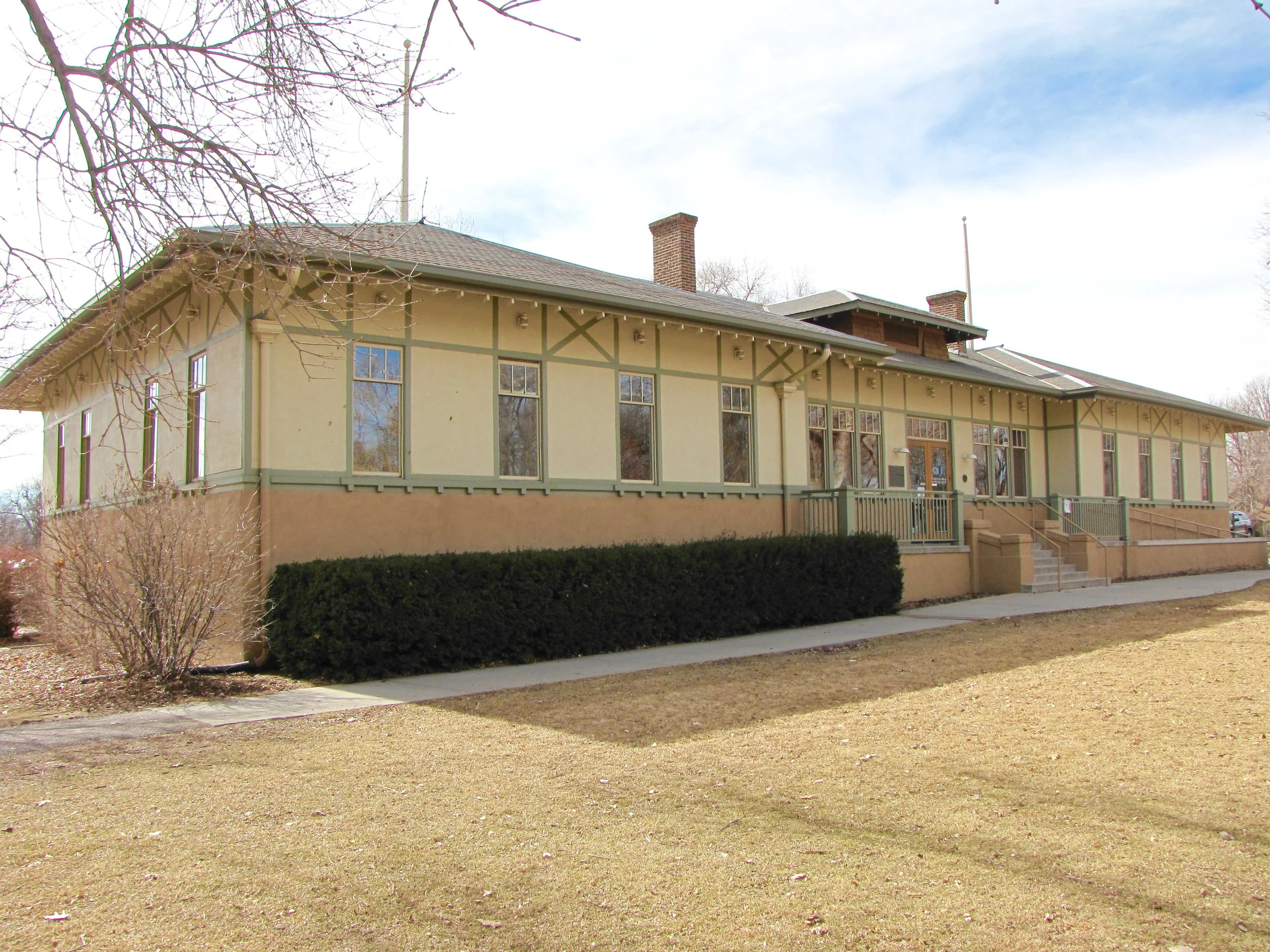
Here are a few of the comments and reviews from clients we have worked with in designing a custom color scheme for their homes. 

“I do believe we have the best looking, most tasteful house in town!  I would have never thought of these colors, but they work so well.  I have been delighted with the results - it approaches a perfect match of color to my sensibilities.”   - Keith

“Your service saved us alot of headaches and near misses.  Although my husband and I have a good design sense, I knew instantly from seeing your color choices and placements that they would work, without even having to see the final result.  Thank you again for your artistry and professionalism!”   - Katherine

“It takes a real expert to not only choose compatible colors but to arrange them tastefully and with respect to what is authentically correct and appealing.  We are extremely satisfied with The Color People and would enthusiastically recommend you to anyone!”   - Barry

“Every time I drive up to our home, I appreciate your amazing talents!”   - Libby

Historic Denver

Historic Denver

As color consultants we are always looking to the latest information on trends and current marketing influencers. Our involvement with the premier international forecasting group, CMG (Color Marketing Group), is vital to staying aware and on top of what is happening not only in the design industry but also in every single trade that is creating or selling products period.

Just as relevant to our work as looking forward is—so too is looking back. We study architecture and design from decades and centuries past that has shaped our history and our modern day culture as well. Without the knowledge and appreciation of former styles, theories, practices and artistic language, how would we be able to build upon those examples—or know how or what to preserve?

Much of what has been lost in our aesthetic is due in part to an unwillingness to investigate our past. There is so much grace and beauty in the simple yet powerful use of proportion. The architects and designers of the Victorian era seemed to carry this innate sense of balance and proportion throughout their work in ways we no longer pay attention to in many cases. This example highlights the value of not only being educated in the history of our arts but also being conscious of our design decisions moving forward.

We have the right and privilege to design, build and shape our future. We therefore must also work to preserve, advocate and educate—the three pillars to sustaining and strengthening our communities, as Historic Denver promotes in their mission statement. We have been a part of this local organization for many years. We are included in their resource list of trusted and qualified tradespeople helping others to preserve and sustain valuable buildings around Denver. 

Another equally important resource to our city is Discover Denver who has partnered with Historic Denver in helping to identify buildings that are significant historically, architecturally and culturally. They are building a citywide survey that will help tell Denver's story. We believe this to be a very worthy cause and we appreciate everyone involved in these efforts. The Color People has provided architectural color consulting services for many of these important buildings and we continue to be involved in designing exterior color schemes for historic spaces all over the city of Denver, the state of Colorado and many other states nationwide.  

Rendering

Rendering

Most of our clients—both residential and commercial—tell us that their biggest challenge is visualizing a new color scheme working on their building. A tool we sometimes use toward easing this struggle is rendering. We would render all day long if we could but ultimately it can truly be more deceptive than helpful for some.

Our work requires us to imagine a home, a building or an whole community and all of its parts and pieces in a different light. We envision a project with an entirely new look and appeal. We consider the architecture, the market, trends and of course, the customer. Most of the time our creative process includes some form of rendering—whether we are looking at actual colors or simply planning in black and white where a contrast or variation in colors should occur. Some renderings could be loosely sketched while other buildings are better shaped and illustrated using computer programs.

We are certainly aware that many of us are visual learners and can relate better to an image when processing a new idea. Some people never even look at a picture or plan and rely solely on verbal descriptions. We employ many practices in communicating with our clients. There are times when it makes total sense to present a detailed rendering of a building. And there are other times when providing a plan for the new scheme and a folder of paint swatches is appropriate. But in each case there is a most crucial piece to the equation—in achieving the best results in visualization or understanding—and that is SAMPLING. We can not stress enough how important it is to sample the actual colors on the actual building. The factors that shape your perception of a color scheme are great—from light and time of day to the scale of which those colors exist. Therefore seeing colors on a computer drawing could create a very different experience for someone versus seeing it live and in person on a structure right in front of them. We always encourage and specify the LIVE version and go into great detail about how to do this in the most effective way possible.

Like I said, we would love to sketch and paint and render all day long but we want our homeowners, business owners and apartment community managers to get the most out of what we have designed for them—and to be able to successfully visualize what kind of impact it will make on their building. In the example we provide below there was a computer rendering done with great attempts at getting as close as possible to what the new color scheme would look like on the building. It is always an approximation of course and even with the best technology there are challenges in representing the existing and updated materials and finishes. I think the rendering does a fair job but looking at the actual paint job you can tell that the computer version lacked some of the subtleties and nuances of the design. Renderings are meant to assist and complement the presentations of our designs but in the end we trust that our ideas and work will be seen in the best and truest light (the light of day!).  

Providing Resources to Homeowners

Providing Resources to Homeowners

The Color People is one of the longest standing and most trusted resources for the premier publication for homeowners and historians alike—Old House Journal. We have been recognized in numerous articles over the years and called on by readers on a consistent basis.

The Color People has been a regular resource for the magazine's list of products and services valuable to homeowners, builders, architects and historians. Now we are proud to have been included in the Old House Journal Online Product Information Resource. Take a look in the Professional Services and Contracting category and make the most of a wealth of knowledge and experience in the field of design.

Working Together

Working Together

Like many historic neighborhoods across America, older neighborhoods are seeing an influx of new architecture—most of which are architectural styles divergent from what currently exists. The challenge is to make the old work with the new and vice versa. When choosing a body color, it is important to take note of the surrounding houses. If they are light you do not want to use a color darker than a mid-value, as it will look out of place and stand out like a sore thumb. You can also pick up similar tones from a nearby property to give a nod to new construction, such as using wood tones from a new apartment building. You can highlight the differing construction materials using subtle details and colors. You want the new colors of a house to make it feel right at home—nestled between the past and the future, working beautifully with both.