Viewing entries tagged
residential exterior colors

In Our Opinion

In Our Opinion

Most people would say that we have a pretty strong opinion about the color White. When we were approached by The Wall Street Journal to give our take on the white-walled leanings of social media platforms such as Instagram, we got the chance to explain our misgivings on this particular trend.

Read The Wall Street Journal article by Abbey Crain, "Why White Walls Are Instagram Gold" and find out why we disagree with the popular staging techniques and what direction we offer instead for greater success in the use of color.

We have Doors!

We have Doors!

We have been strolling the neighborhood for signs of new growth. This is an area of great diversity and there are homes being renovated and parks being constructed. There are bike lanes being added and food trucks being converted into restaurants. It is busy! And that is great news for us business owners and in general, for those of us invested in this thriving cultural scene.

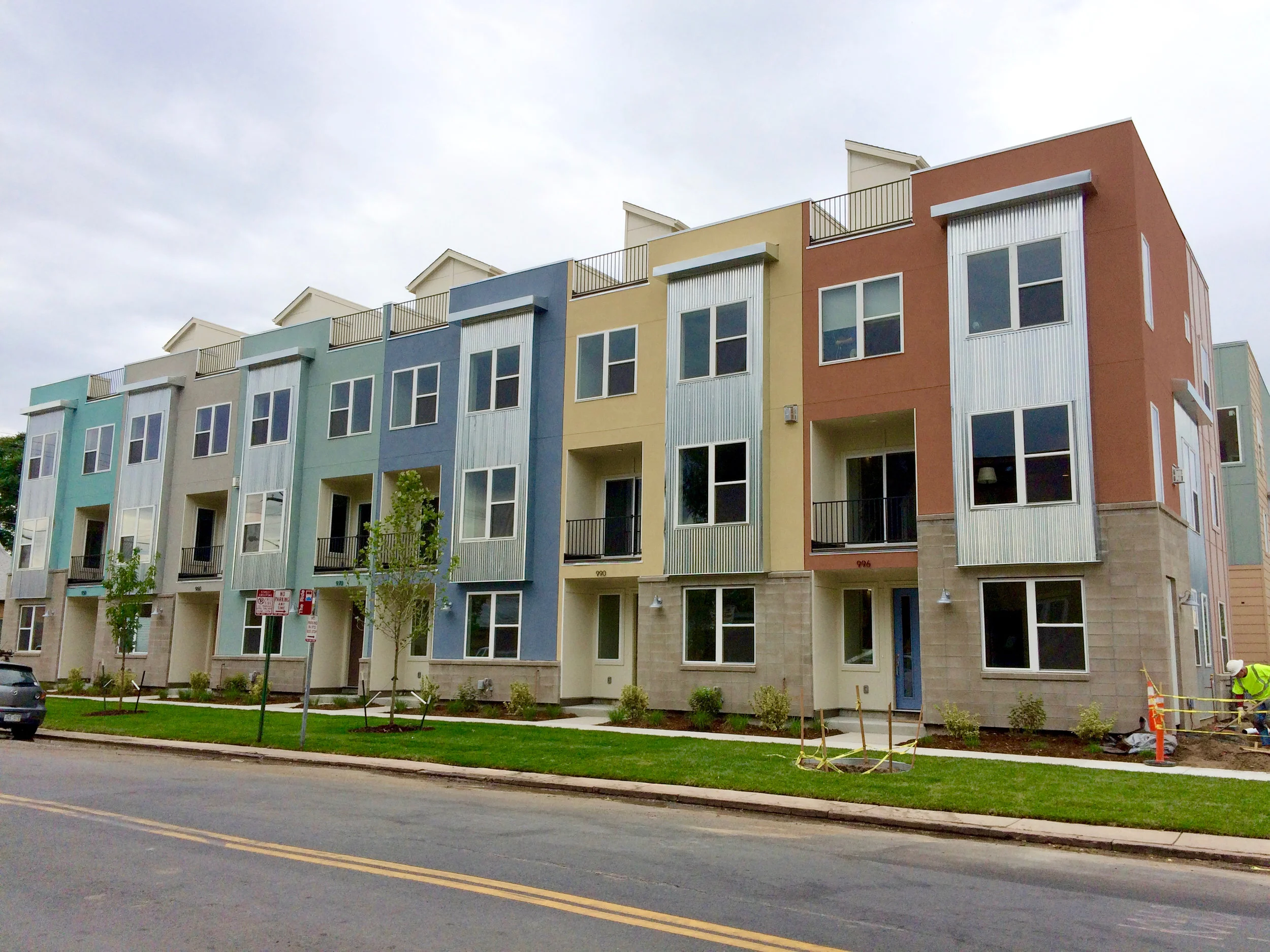
We blogged about the row homes we designed exterior schemes for and promised to update you with their progress. Well... WE HAVE DOORS! And dogs in the windows and all kinds of activity on the street front. It seems they have attracted a number of folks interested in living in the thick of the city and in the heart of a great art district as well. Our colors seem to be setting the right tone and appealing to a great community—and that was exactly our hope for this project.

Enjoy these updated images! 

PRO TIP: WHY USE SATIN

PRO TIP: WHY USE SATIN

Reasons to use a Satin finish instead of a flat finish on buildings (Commercial or Residential):

 - The colors look richer and have more life.

 - The finish is stronger than flat.

 - Flat finishes have a tooth which holds dirt. The shinier finish of satin paint allows the dirt to wash off making your buildings stay cleaner and feel newer.   

Telling A Story

Telling A Story

When we begin the process of consulting with a homeowner on a new design scheme for their home's exterior, we look at their photos first—or in many cases, here locally—we visit them at their home so we can see it in person. Our clients are tasked with providing us with a visual story of their home—and they usually do a thorough job as it is something they look at and notice daily.

We try to really take in and imagine what this home looks like—both as a whole composition and also in its parts and pieces. The architecture reveals itself and therefore so does its story. This is the place where our design direction takes off.

The first thing we do is ask ourselves, "What is this house trying to say?" There is always a prominent message and our path to color is inherently grounded in this statement.

With this story in mind, we then investigate what the homeowner has relayed to us in their questionnaire. They have responded to questions on color, mood, surrounding environment and desirable degrees of detail. There are usually more clear responses about what people don't like and that can be just as helpful.

Our next step—the critical one and the true design challenge—is to take that initial story and translate our client's needs into that. Our goal is always to have our homeowner be happy everyday they come home—but we also are architectural color experts and ultimately hope to present the true message of what that house can be. It is a wonderfully unique and creative solution that is required and that we strive to provide for our clients—AND is the reason why our role is so important as Storyteller/Consultant/Designer.

Art Row in Progress

Art Row in Progress

We were hired by a developer to consult on the design and exterior color for a community of new row houses in our neighborhood. We work in a designated design district of Denver and love to be involved in local work affecting our area's unique character. It is a lively, culturally rich and artistic place and it was vital to relay this in our design solution for this housing project.

There were many different materials to coordinate and work with—including stone, siding, windows and roofing—so the overall concept needed to be cohesive with all of these selections. The placement of color was an important decision grounded in emphasizing the architecture of these buildings and also in making the right statement to its users.

We came up with selections in materials and a palette of colors that gave life to this unique community. Our intent was to create a perfect street and neighborhood presence and to be able to attract the right customer base for our client.

The project has been underway for several months and we have been excited to see it take shape. It has just reached the point of color sampling and now we are even more anxious to see it completed—and to watch as it takes off in this thriving market.

These photos give a sense of the process and some of the steps going on within this and other similar consulting projects for new developments. Continue to follow us on our blog and social media for more updates on this vibrant community.

Online Resource for Homeowners

Online Resource for Homeowners

We get calls and emails on a fairly consistent basis from homeowners who are looking for advice on specific painting issues—whether they are wondering what time of year to paint or attempting to paint an appropriate color sample on their home. We want to make sure each customer or DIY'er is armed with helpful information. A great resource we often reference ourselves is a website with a wealth of knowledge and practical advice—The House Painting Guide

The House Painting Guide is a valuable tool for researching information on painting your home—from learning about the painting process to specifics on the actual paints themselves. You can get started in your home renovation with the help of this website's tools and tips—and as they suggest, turn to expert color consultants—The Color People—for our added design expertise and experience in the field of exterior architectural color in order to complete the vision you have for your home.

Here are a few of the comments and reviews from clients we have worked with in designing a custom color scheme for their homes. 

“I do believe we have the best looking, most tasteful house in town!  I would have never thought of these colors, but they work so well.  I have been delighted with the results - it approaches a perfect match of color to my sensibilities.”   - Keith

“Your service saved us alot of headaches and near misses.  Although my husband and I have a good design sense, I knew instantly from seeing your color choices and placements that they would work, without even having to see the final result.  Thank you again for your artistry and professionalism!”   - Katherine

“It takes a real expert to not only choose compatible colors but to arrange them tastefully and with respect to what is authentically correct and appealing.  We are extremely satisfied with The Color People and would enthusiastically recommend you to anyone!”   - Barry

“Every time I drive up to our home, I appreciate your amazing talents!”   - Libby

PRO TIP

PRO TIP

PRO TIP:

Dark colors go on the bottom - light ones on top! That is because people perceive dark as being heavy and if the heavy part is not at the bottom the building will feel disconcertingly top-heavy.

It’s time for homeowners to get back into shape—so muscle up, grab the phone (or click on the CONTACT US NOW button on our homepage) and seek professional help with your home’s exterior renovation! You only have one chance to make the right impression and that is what The Color People are expert at.

Providing Resources to Homeowners

Providing Resources to Homeowners

The Color People is one of the longest standing and most trusted resources for the premier publication for homeowners and historians alike—Old House Journal. We have been recognized in numerous articles over the years and called on by readers on a consistent basis.

The Color People has been a regular resource for the magazine's list of products and services valuable to homeowners, builders, architects and historians. Now we are proud to have been included in the Old House Journal Online Product Information Resource. Take a look in the Professional Services and Contracting category and make the most of a wealth of knowledge and experience in the field of design.

Creating a better painter/designer dialogue

Creating a better painter/designer dialogue

This is an article we wrote awhile back that we continue to learn from and refer our clients to. In it we discuss how our consulting practices and unique system of communication lead directly to a more enjoyable relationship between homeowner, designer and painter and a much more successful experience overall.

How long does our painting season last?

How long does our painting season last?

We work with homeowners all across the country and they all have the same question: When is it too late to paint? The simple answer is—it depends. Unlike the NFL there is no official first game day that tells us our season has started or come to an end. There are many factors that come into play and different areas will have a longer or shorter painting window than others.

We are located in Denver, Colorado and our season tends to wind down toward the end of September. The main reason for that is the fluctuation of temperatures. It can go from 35 degrees in the morning to 80 by noon and then back down to 50 by dinner time. It’s anybody’s guess how long the sun will shine its light on one particular side of a house allowing for the proper temps to paint by. And as soon as the shadow is cast, so is the worry of having a paint job that lasts. 

Temperatures are of importance of course and we have always played it safe and informed our clients that 50 degrees is as low as you want to go. There are paints that have a lower minimum ambient temperature but they come at a premium cost. Even though your temperature might be just right when your painter has arrived and is ready to roll, you still must consider the temperature fluctuations as I mentioned previously.

Be wary of a painter who dismisses these details and promises to be available and open for business all year round. It just isn’t possible to paint during all seasons and come out with a successful paint job. Both appearance and durability are at risk.

There may be painters who work well into November and even December in some areas, but if they tell you they block off October to May don’t be surprised—and know that next year your home’s paint job will still be there waiting for you and it will look right when it’s done.

Sampling your color scheme

Sampling your color scheme

There is no good way to show what a color scheme will look like before it is done. Surprisingly, computer renderings are actually more deceptive than they are helpful because there are so many variables which cannot be accurately calibrated.

Sampling is an essential part of our system. The only way to see what colors are really going to look like is to paint a sample on your building. Color is totally relative. Most colors will change at scale and may change in proximity to each other, so in order to see the colors correctly you must take this step. 

How do you sample? Buy some quarts of the paint colors in the custom color scheme we have designed for you. In an area about 4 or 5 feet square, where all the colors come together, put up your sample. A cornice area is usually good—or a porch or gable. Paint as indicated on the marked photographs or plans. If you are painting it on the side of a building like around a window—or if the existing siding is a particularly strong color—make sure to paint a large area of the body color so that the old color will not affect the look of the new color. Just painting stripes of colors will not help!

Once it is done stand as far away as possible to look at it. Do not stand right in front of it! Get at least 100 feet away—preferably 100 yards away, no kidding. The farther away you stand the easier it is to envision the building in your mind’s eye as it will look in the new color scheme—and the easier it is to not be influenced by the old colors.

And have fun—the painting process is always an adventure!