Paint Palette Alternatives

Paint Palette Alternatives

Awhile back we were asked to contribute on a design exercise for This Old House magazine. The homeowners wanted to see how different color schemes would effect the appearance of their 1901 Edwardian home, in the hopes of finding the right balance between historical and more current palettes. We were able to use Photoshop to mock up various designs by to assist in the visualization process. Read the entire article to see how each color scheme effected the tone of the architecture and the overall curb appeal and which one the homeowners were most drawn to.

The Mid-Century Modernist Movement

The Mid-Century Modernist Movement

This style harkens back to the architecture of the 50’s and early 60’s. It incorporates everything from late International Style to the ranch style home to California modern. The characteristics are predominantly horizontal and angular buildings with flat or low pitched roofs, wide eaves and lots of glass. This style brought us the patio door and picture window. Interiors are open and unadorned. The exterior materials tend toward panels or smooth faced brick, cut ledge stone, or plain stucco. They are characterized by very simple plans and a lack of any and all decorative elements.

This style, called Mid Mod Revival and its update, Modernist, is extremely popular amongst the Gen-X, Gen-Y and Millennial demographics as well as Boomers who are returning to the homes they grew up in. Nationally there is clearly a desire for something new. People are getting tired of “old” style architecture.

This modernist style seems cool and fresh after three decades of basically 19th century architectural forms and retains the plain open interiors and open kitchen/family room/living space which appeal to the new generation of young adults that have never lived with it before. It also resonates with rekindled interest in simple living and more responsible eco-friendly thinking.

It is rapidly becoming THE style for multi-family housing especially in reviving inner city neighborhoods as well as new building on the urban edges near new light rail transportation systems that are taking hold in most aspiring cities. You will find elements of this style in condos, townhouse and apartment communities of every fashion, from two-story to high rises. It is often called “Loft Style,” trying to capture the fashionable flavor of downtown loft projects. A real draw is that the style is also fairly cheap to build as it has minimal detailing or fussy embellishments. 

The style is basically characterized by concrete, stucco, or smooth faced brick punctuated with panels of metal, wood, tongue-and-groove wood or something similar. Angular metal railings for balconies, stairs and the like are an essential style motif as are large plate glass windows. Commonly now alternative energy ideas are incorporated in the designs—everything from solar panels to grass roofs. Sustainable materials like bamboo are commonly used especially on the interiors.

This is also clearly the preference for the majority of young architects coming onto the scene who are going to be taking over the industry and are hungry to do something new and exciting. This is not a force to be overlooked. Everywhere you look you see new work by young architects who have embraced this direction as their own.

PRO TIP

PRO TIP

Using splotches of colors here and there tear apart the visual statement of a building. They end up looking like postage stamps of color just stuck onto the facade. This is a good example of a home that lost its overall statement and wholeness by using various colors picked with no relation to the building or to each other. Check out our Residence gallery for ideas on how to make the right statement for your home.

Victorian Era Colourists

Victorian Era Colourists

On a recent trip to Scotland I came across the paintings of several artists belonging to a group known as the Glasgow School. The collective work of this group flourished from the 1890s to around 1910. The popularity of these artists was influenced by the heightened economy at the turn of the century in Glasgow. It directly led to an influx in contributions in architecture, design and painting—especially associated with the Art Nouveau movement.

There were examples of these works in many of the museums I visited, including the Hunterian Museum and Art Gallery and the Kelvingrove Gallery and Museum. I was particularly drawn to the collections of these Scottish Colourists and especially impressed by the work of husband and wife team, glass-artist Margaret MacDonald and architect Charles Rennie Mackintosh.

How to pick a painter

How to pick a painter

Unfortunately the craft has by-and-large gone out of painting. These days every unskilled guy who is out of work calls himself a painter and the majority of those who do paint full-time are not interested in anything they can’t spray or paint with a four-inch brush. This obviously poses some problems if you are looking for a decent paint job for your old home.  So, here are a few tips that have worked well for me.  

There are basically two types of painting contractors:  production painters who do large developments, rental properties, etc., and custom painters. Start with custom painters. Call a few and see if they have done a number of Victorians or homes similar to your own and make sure they sound “positive” about them. Omit the ones who don’t sound positive -- you have to love these buildings to paint them well.  

Ask for references of jobs done 3 or 4 years ago and examples that you can look at. Go look and check the references. Then narrow your candidates down to three.  

In making your choice, do let personality play a part in your decision. If you relate well to the painter, if you like the cut of his jib or if talking to him is easy, these portend success of the paint job. For example, if two people are equally qualified but one you like and the other you don’t feel so good about, you will be ten times happier with the former painter by the time the job is over. Also, choose someone who has a reputation to protect. These people will do it right (generally), because they don’t want to come back and fix it if the paint is peeling in three years.  

Price should be dictated by the amount of labor and detailing involved. Be leery of the painter who wants to charge you so much for three colors, so much for four colors, and so on. Many times there is no more labor involved in adding another color other than opening another can of paint.  

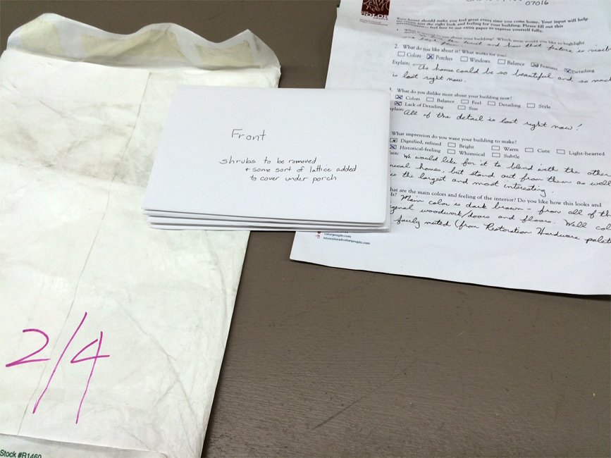
Write up a contract. Be very specific about what exactly will be done, particularly concerning the prep job. What is included:  glazing?  cleaning windows?  replacing rotted wood?  scraping, sanding and filling? Also set up a payment schedule (for example, 1/3 up front, 1/3 part way, 1/3 at completion). Be equitable but protect your interest. Set a time of completion... if not a specific date, then a time period. Put in a penalty clause if the work is not done on time. Painting your house will be a major disturbance in your life and you don’t want it dragged out.  

Be careful of a low bid. An exceptionally low bid usually means that halfway through the job the painter will realize he is going to end up in the hole and he will get out as quickly as he can. If you have the time and knowledge, you can supervise the job and get good results, but it’s not a good situation if the painter knows he’s losing money. Remember, “you get what you pay for” -- use a painter with a reputation to uphold.

Restoration Trades Directory

Restoration Trades Directory

The Color People has been featured over the years in the online resource Restoration Trades Directory. RTD is a valuable tool for those seeking expert knowledge in the custom building and restoration fields in the United States and Canada. The website provides curated listings, facts and advice for all kinds of people—from homeowners to builders and historians. We have been called upon to give input in various subjects and we have recently shared a story on a project we completed for a homeowner in our local community. At this time of year we are constantly getting inquiries for exterior color consultations for residences. The home showcased in this month's RTD article is a great example of how our architectural color consulting services can add valuable curb appeal to a property and give life back to a home with a rich history in Denver. 

http://www.restorationtradesdirectory.com/content/home_left_behind

Color Marketing

Color Marketing

I work with building exteriors where color has become hugely important. Markets are now so tight there is barely any difference between what competitors are offering at the same price points. The only thing you have to set your product apart is a look, a feel—in short, Color. Of course no one wants a trendy home. But yet there are distinct trends for the housing industry as well as for retail buildings. If you repaint and choose colors from the end of a color trend in two years your project will not just look out of date, it will look ten years old!

The trend information I glean from being a member of Color Marketing Group (CMG) not only allows me to offer much more than my competitors from a color perspective but the additional knowledge I gather about what drives these trends gives me the insight to provide nuanced colors that resonate emotionally with buyers, tenants and shoppers.

The Color People, together with Benjamin Moore and Denver Design District, is hosting a CMG Chromazone in Denver on June 15th. This workshop is a unique opportunity to exchange your ideas on what is shaping color amongst multi-industry color professionals. The work that is produced here will lead directly to a final forecast that represents colors that will be trending in 2018 and beyond.  Please join us!

Punch Color

Punch Color

Architectural color experts use a punch color adding pizzazz to a home and defining the features. On a traditional house it's typical to use one on the shutters and front door. A punch color is like the tie on a man’s suit—a punctuation mark that brings the whole look together. A suit looks different when you are wearing a club tie versus a Hawaiian tie, and just like with a suit, the punch color dictates how a home presents itself. Figure out who you're trying to attract and pick a color that creates the right tone to sell to that person, or just to please yourself. Make everyday more colorful!

A Path to Color for Homeowners

A Path to Color for Homeowners

For many reasons homeowners seek out our color expertise to design a custom color scheme for their home. Many have tried to go it alone, spending a lot of money on paint samples only to be left disheartened. Others have been researching and planning a renovation for years and bring with them references, idea books and folders full of inspiration. We have clients approach us for help because they have had hail damage on their roof and are replacing it—and so they figure it’s a perfect time to update the entire exterior. We also get calls from owners who are selling their home and want it to be in the best possible shape for putting it on the market. Likewise, we get calls from realtors who are trying to aid their clients with added curb appeal that will ensure increased attention and better sales.

For all of these reasons we are the right color consultant and color expert for the job. We work with folks from all over the country and so have developed a mail order system for homeowners to easily use in what could otherwise be a daunting process. We mail or email out a Color Kit that includes a questionnaire that gets to the bottom of what our clients are hoping to achieve with a new color scheme. It allows them to ask themselves questions about color and interiors and their surrounding environment—ultimately giving us great insight into what direction we should take in our design. Also included in the Kit is a guide on how to take photos of the home. These photos will then be used to mark up with color placements in order to give the painter an exact guide for where to paint each new color selection. 

When we receive a packet from a homeowner there are several steps we go through in designing a new color scheme for their home. We start with the questionnaire and any references they may have given us. There is a great deal of knowledge we bring to the thought process from our education and experience. This is a creative process that also involves intuition. We have documented a few steps in this process visually—from receiving a package to working with value studies and then finally studying and working with color samples. It is important for us to visualize a home in black and white first—without any preconceptions about where color should go. In this particular case, we had the benefit of working on a home that was completely painted in white. So we were able to start from scratch and do several value studies which give an idea where the darkest to lightest value should go. For example, the base and foundation of a home would look better if it was darker to emulate the feeling of being sturdy and grounding. The windows and porch might appear more inviting and open if they were in a lighter value. These are the kinds of ideas that our mind relays with neutral colored pencils in order to give us a general map of where color should go. After we have that in place we work with color. A great deal of this begins with the givens—whether it is directly from what the homeowner likes or dislikes or it could also stem from what material will be unchanged, be it a roof or a brick or stone. We take all these things into account. When we have a palette of colors that works for the home we then work in detail to make sure that every feature of the architecture is given attention and its appropriate color.

In the end, we want a home that our client is going to love coming home to everyday. It may not be in our particular taste or style, but it is perfect for that home and the people residing in it. Working with homeowners is a favorite part of our business and we’ve been doing it for decades. We have designed for every architectural style and for every kind of client in all parts of the country. We take great pride in our work because we know you do too.

Color in interior spaces

Color in interior spaces

A color expert can come to the rescue! Often in apartment communities, interior spaces are left in dark shadow with poor lighting and dark siding colors wrapped into them. Not only does this make for a fairly depressing experience every time a resident comes home but these halls can be just plain scary to some having to come and go at night. It can be particularly worrisome for women living in and using these uncomfortable spaces. We recommend painting the interior walls in a light color and the ceilings in an off-white—and up the wattage of your bulbs. This is not the place to save money. Eliminating this problem can directly translate into better showings for potential customers but just as importantly can increase retention because your tenants find coming home much more pleasant.

COLOR SELLS

COLOR SELLS

There is not a single product where color does not impact the purchasing power. The Denver Post article relays the issue of importance of color in sales specific to the brand Case Logic. In the article, color expert James Martin of The Color People provides insight into color trends and The Color Marketing Group's strategic tagline "Color sells. And the right color sells better!"

Color Trends and Multi-Family Marketing

Color Trends and Multi-Family Marketing

The multi-family industry across the whole country is in the midst of a color trend change. This change is taking place everywhere from fashion to products and housing. For the last fifteen years we have been influenced by colors with historic antecedents which are basically khaki based colors—earthy and muted. The current color trend is based on what is being called the Mid- Century Modern Revival. As architectural color consultants, we see this as atrend that is going to last for the coming decade.

The change comes from the renewed interest in the period from 1955 to 1965. The Mad Men tv series is the most obvious flag bearer for this genre. There is also a renewed interest in mid-century homes especially by the millennial generation as well as suburban boomers returning to the urban world. In our core cities almost all new multi-family housing is reflective of this period of architectural styles.

As a rule, millennials are the ones seriously drawn to all things Mid-Mod. So if you are trying to appeal to them and are looking for your communities to attract this generation through the next ten years it is going to be imperative that you plan now for these properties to offer a look and feel that appeals to them. And don’t forget the boomers—always hip to the latest thing— they're now looking to live in places reflective of “what’s going on.”

Translated into colors this means that we are going to be seeing things based on a gray-toned palette rather than khaki. And since vivid color is the new measure of looking current we are going to see a lot more use of unexpected color on buildings that herald the fact that the properties that use them are up to date. We are already seeing oranges and reds though these are already passé. As the public gets more and more sophisticated and 50s colors are more common the palette is going to change to turquoises, icy blues and cool yellows. What may be seen now as a bit outlandish will quickly be see as the norm.

As color trend experts we see our job as making sure your property looks up to date and on the front end of color trends throughout your whole eight-ten year paint cycle. This new color family will need accents because living in grays solely will never really be something that makes for an outstanding statement nor will it attract the millennial market. If, as a savvy marketer, you want to appeal to the young resident you will be wise to take the opportunity and really step out from your competitors before you find these other properties going bold and outshining yours. Never forget, it will be years before you can paint again.