Viewing entries tagged
multi-family

Art Row in Progress

Art Row in Progress

We were hired by a developer to consult on the design and exterior color for a community of new row houses in our neighborhood. We work in a designated design district of Denver and love to be involved in local work affecting our area's unique character. It is a lively, culturally rich and artistic place and it was vital to relay this in our design solution for this housing project.

There were many different materials to coordinate and work with—including stone, siding, windows and roofing—so the overall concept needed to be cohesive with all of these selections. The placement of color was an important decision grounded in emphasizing the architecture of these buildings and also in making the right statement to its users.

We came up with selections in materials and a palette of colors that gave life to this unique community. Our intent was to create a perfect street and neighborhood presence and to be able to attract the right customer base for our client.

The project has been underway for several months and we have been excited to see it take shape. It has just reached the point of color sampling and now we are even more anxious to see it completed—and to watch as it takes off in this thriving market.

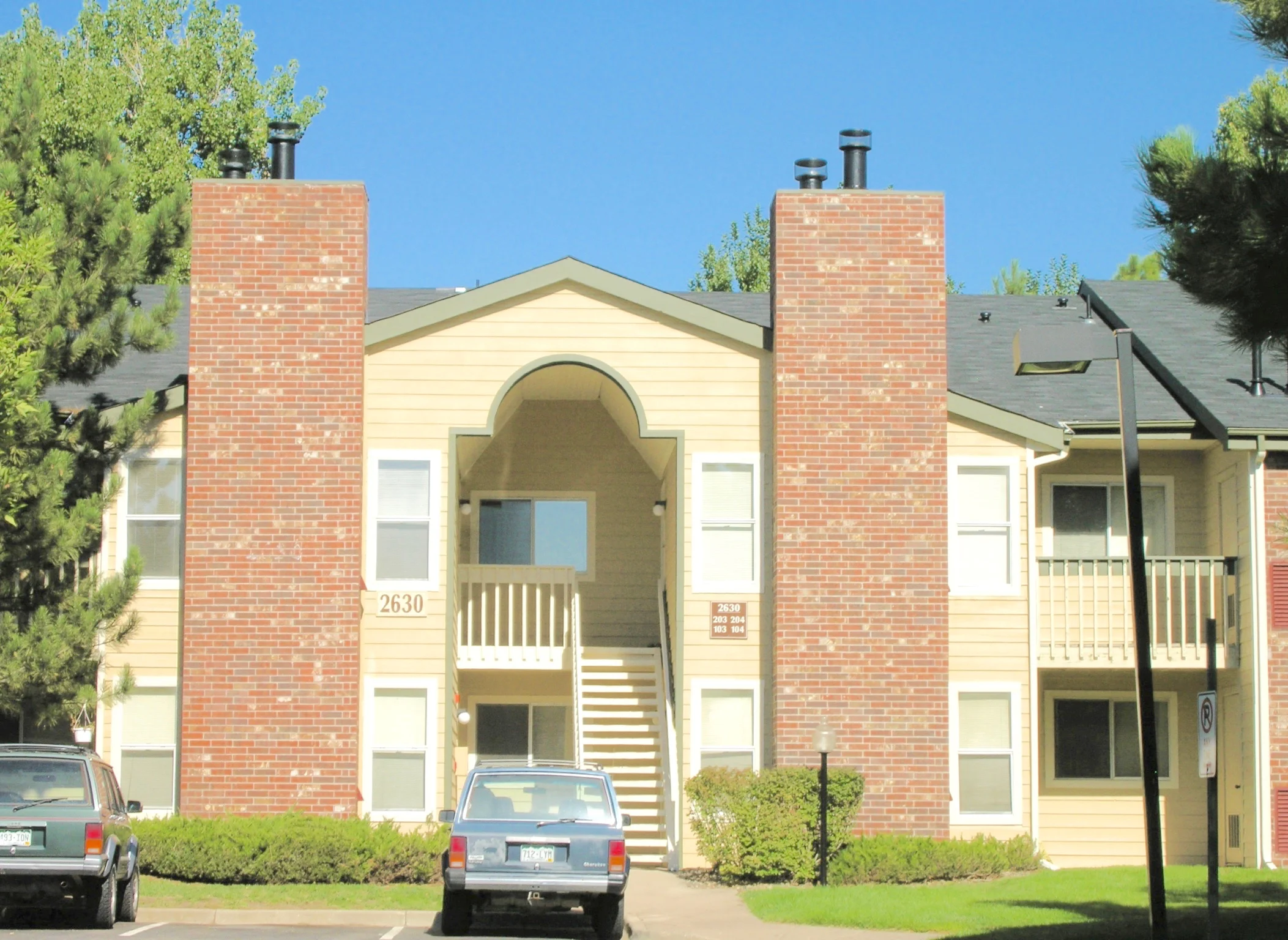
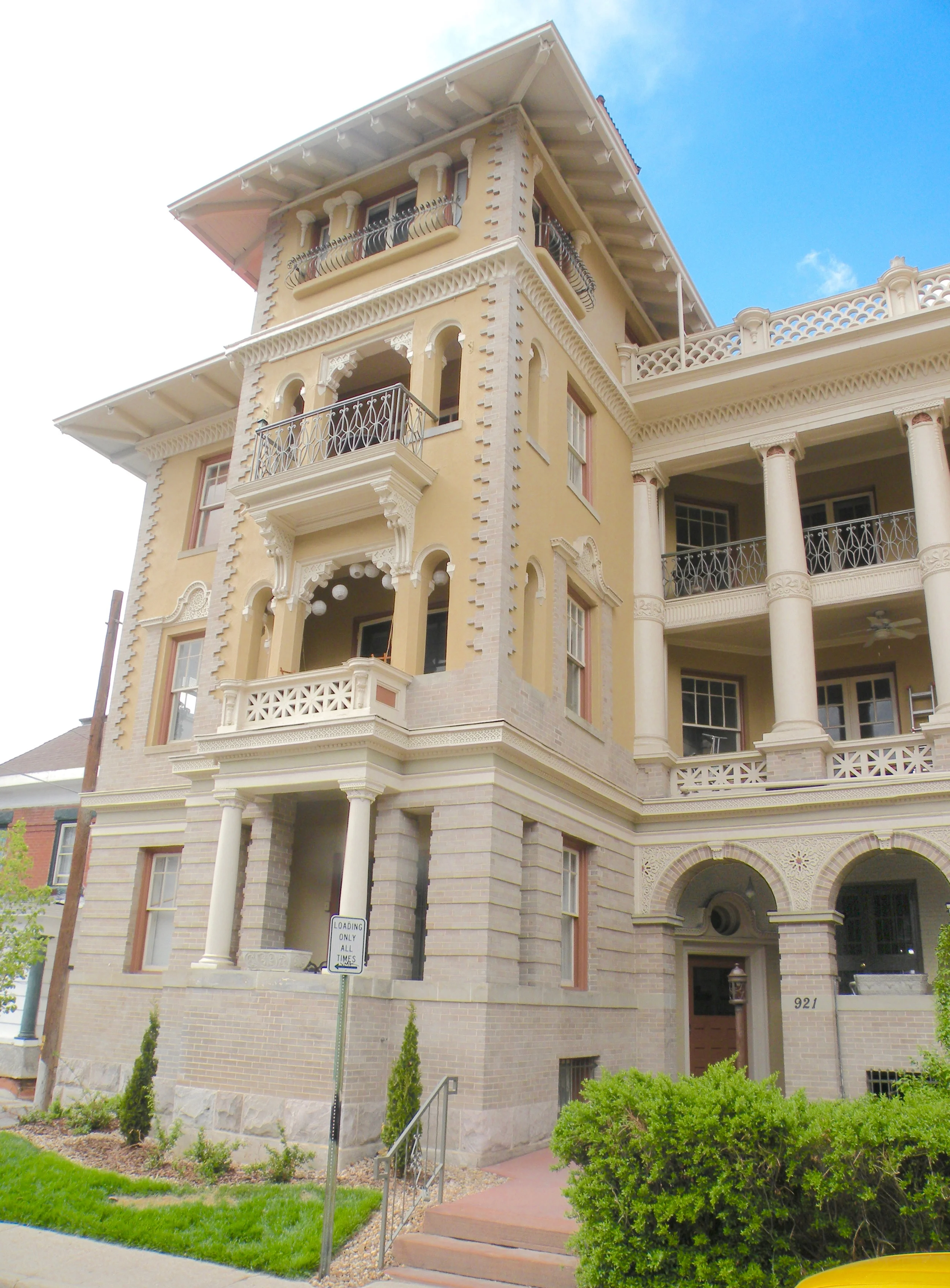
These photos give a sense of the process and some of the steps going on within this and other similar consulting projects for new developments. Continue to follow us on our blog and social media for more updates on this vibrant community.

Color in interior spaces

Color in interior spaces

A color expert can come to the rescue! Often in apartment communities, interior spaces are left in dark shadow with poor lighting and dark siding colors wrapped into them. Not only does this make for a fairly depressing experience every time a resident comes home but these halls can be just plain scary to some having to come and go at night. It can be particularly worrisome for women living in and using these uncomfortable spaces. We recommend painting the interior walls in a light color and the ceilings in an off-white—and up the wattage of your bulbs. This is not the place to save money. Eliminating this problem can directly translate into better showings for potential customers but just as importantly can increase retention because your tenants find coming home much more pleasant.

Color Trends and Multi-Family Marketing

Color Trends and Multi-Family Marketing

The multi-family industry across the whole country is in the midst of a color trend change. This change is taking place everywhere from fashion to products and housing. For the last fifteen years we have been influenced by colors with historic antecedents which are basically khaki based colors—earthy and muted. The current color trend is based on what is being called the Mid- Century Modern Revival. As architectural color consultants, we see this as atrend that is going to last for the coming decade.

The change comes from the renewed interest in the period from 1955 to 1965. The Mad Men tv series is the most obvious flag bearer for this genre. There is also a renewed interest in mid-century homes especially by the millennial generation as well as suburban boomers returning to the urban world. In our core cities almost all new multi-family housing is reflective of this period of architectural styles.

As a rule, millennials are the ones seriously drawn to all things Mid-Mod. So if you are trying to appeal to them and are looking for your communities to attract this generation through the next ten years it is going to be imperative that you plan now for these properties to offer a look and feel that appeals to them. And don’t forget the boomers—always hip to the latest thing— they're now looking to live in places reflective of “what’s going on.”

Translated into colors this means that we are going to be seeing things based on a gray-toned palette rather than khaki. And since vivid color is the new measure of looking current we are going to see a lot more use of unexpected color on buildings that herald the fact that the properties that use them are up to date. We are already seeing oranges and reds though these are already passé. As the public gets more and more sophisticated and 50s colors are more common the palette is going to change to turquoises, icy blues and cool yellows. What may be seen now as a bit outlandish will quickly be see as the norm.

As color trend experts we see our job as making sure your property looks up to date and on the front end of color trends throughout your whole eight-ten year paint cycle. This new color family will need accents because living in grays solely will never really be something that makes for an outstanding statement nor will it attract the millennial market. If, as a savvy marketer, you want to appeal to the young resident you will be wise to take the opportunity and really step out from your competitors before you find these other properties going bold and outshining yours. Never forget, it will be years before you can paint again.