Palm Springs, California

Palm Springs, California

I just returned from a trip to Palm Springs, California. As anticipated, I found a renewed sense of architectural richness and variety and beyond that, a renewed faith that there are indeed people and places living in color. They are not afraid to use this powerful tool and creative force of color in every possible outlet.

There is an energy in the culture, the landscape and in the overall spirit of this special locale. Not only does great and renown architecture exist here and continue to develop with new construction and design—but you find this unique energy in the simplest of products and settings as well.

There is a thriving scene of sophisticated travelers, retirees and locals alike. You can tell that there is a great pride in the city's innovative and edgy purpose. It makes you truly appreciate how uninhibited design evolution can create an environment we long to be in.

In the coming weeks we will be featuring imagery from these travels on our various social media platforms (Facebook, LinkedIn, Pinterest and Instagram) so please check them out—enjoy and put Palm Springs on your destination wish list.

Inspiration

Inspiration

I was told once that the key to being an excellent designer is being inspired. I have been poring over a book about Alphonse Mucha that has given me a means to finding creative energy in my work and in my daily living as well.

Alphonse Mucha was a Czech painter and decorative artist born in 1860. He moved to Paris in his late twenties and was producing magazine and advertising illustrations. Mucha got his big break in 1894 when visiting a local print shop. He heard about a need for a new poster advertising a play featuring Sarah Bernhardt, the most famous actress in Paris. The poster he designed was a huge hit and garnered the attention of many, including the actress herself who signed Mucha on to do work for her throughout the next 6 years.

The multitude of his paintings, posters, advertisements, illustrations and other design work led to the term The Mucha Style—and became better known as Art Nouveau (French for "new art").

This stylistic form of art and design, with its universal aesthetic and luscious colors, inspires us in our lives and in the designs we work to create everyday.

Historic Denver

Historic Denver

As color consultants we are always looking to the latest information on trends and current marketing influencers. Our involvement with the premier international forecasting group, CMG (Color Marketing Group), is vital to staying aware and on top of what is happening not only in the design industry but also in every single trade that is creating or selling products period.

Just as relevant to our work as looking forward is—so too is looking back. We study architecture and design from decades and centuries past that has shaped our history and our modern day culture as well. Without the knowledge and appreciation of former styles, theories, practices and artistic language, how would we be able to build upon those examples—or know how or what to preserve?

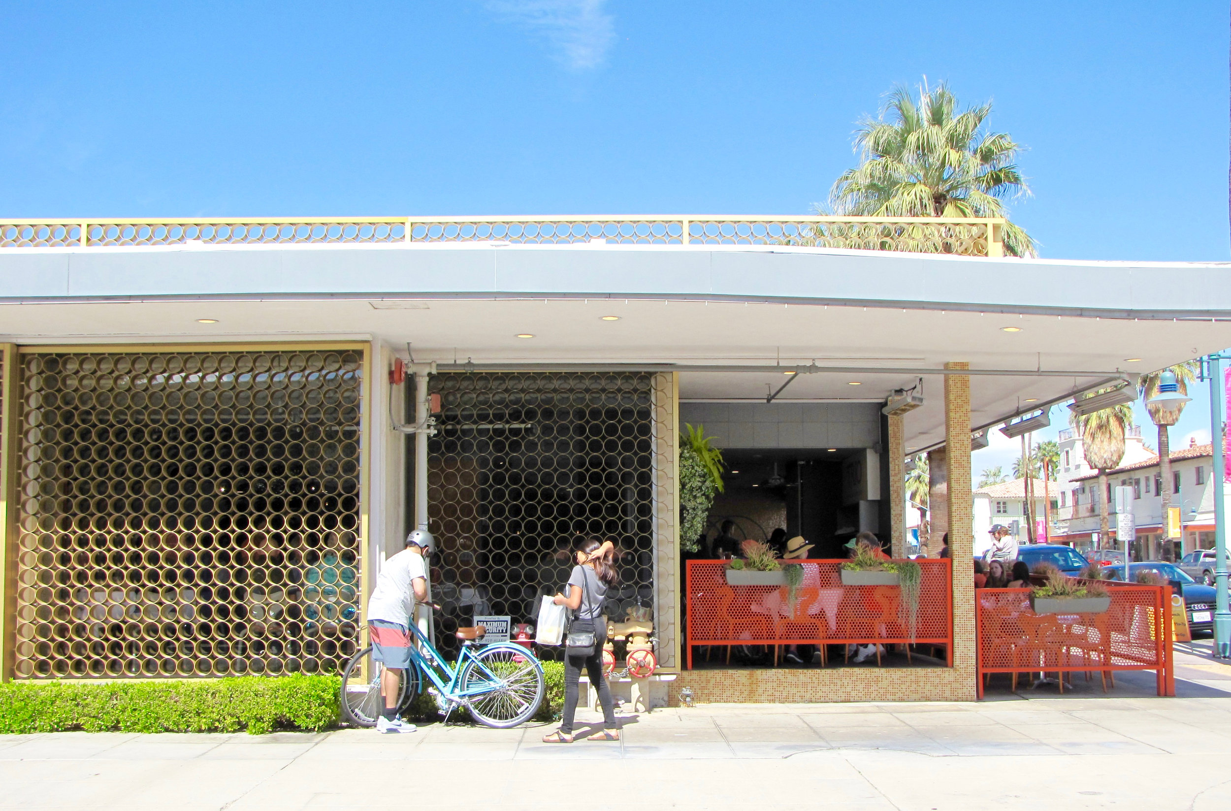
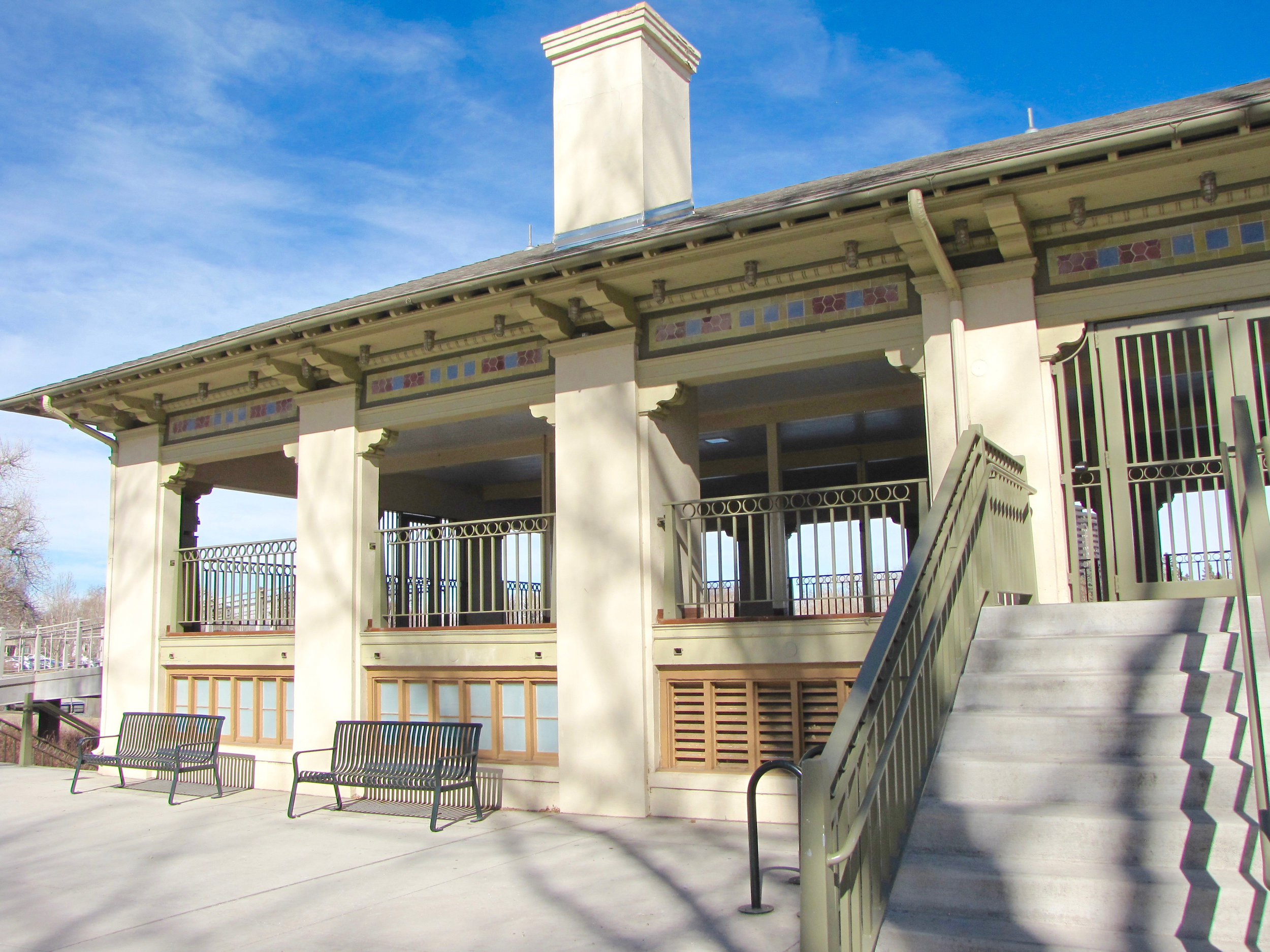
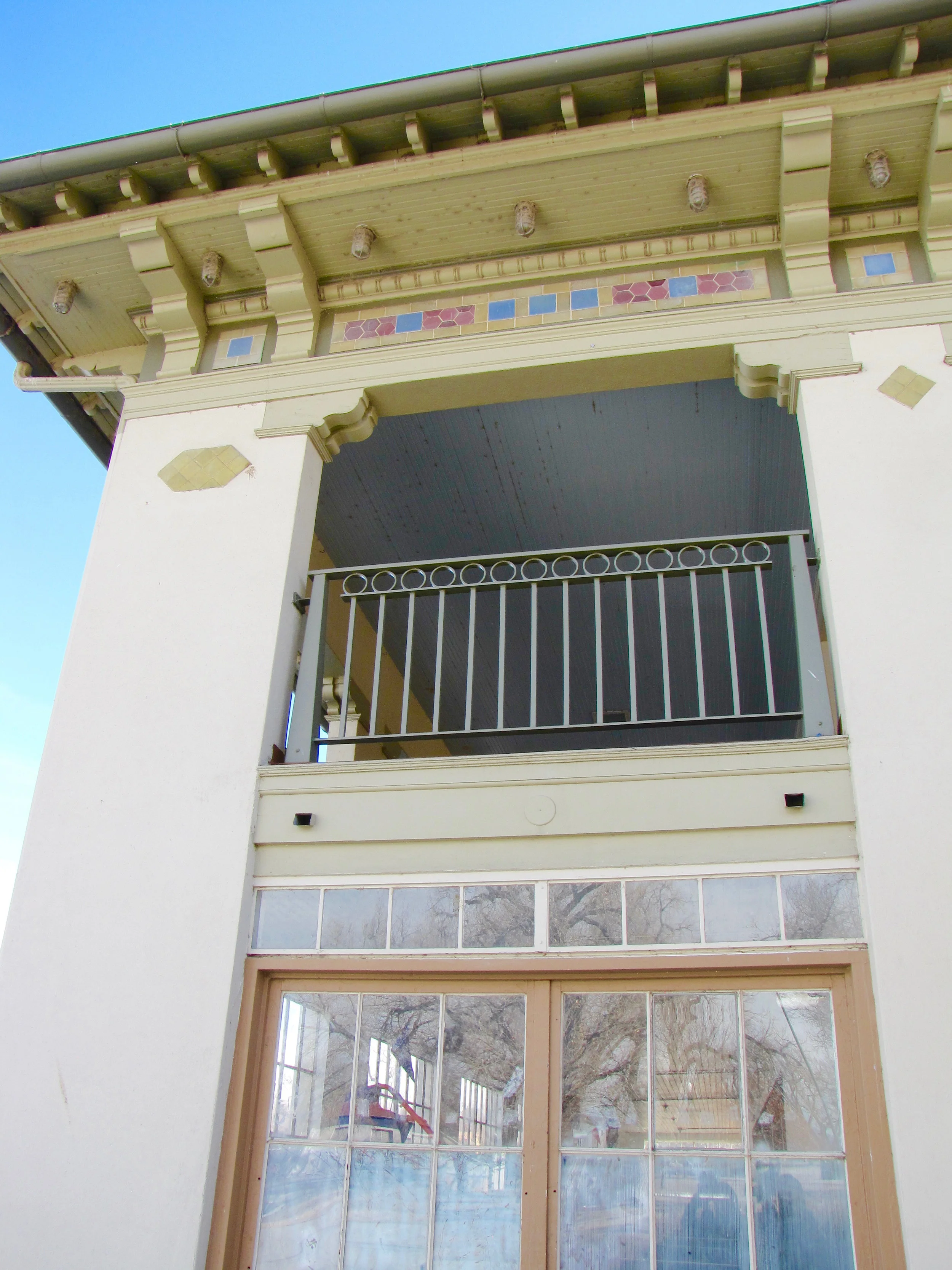
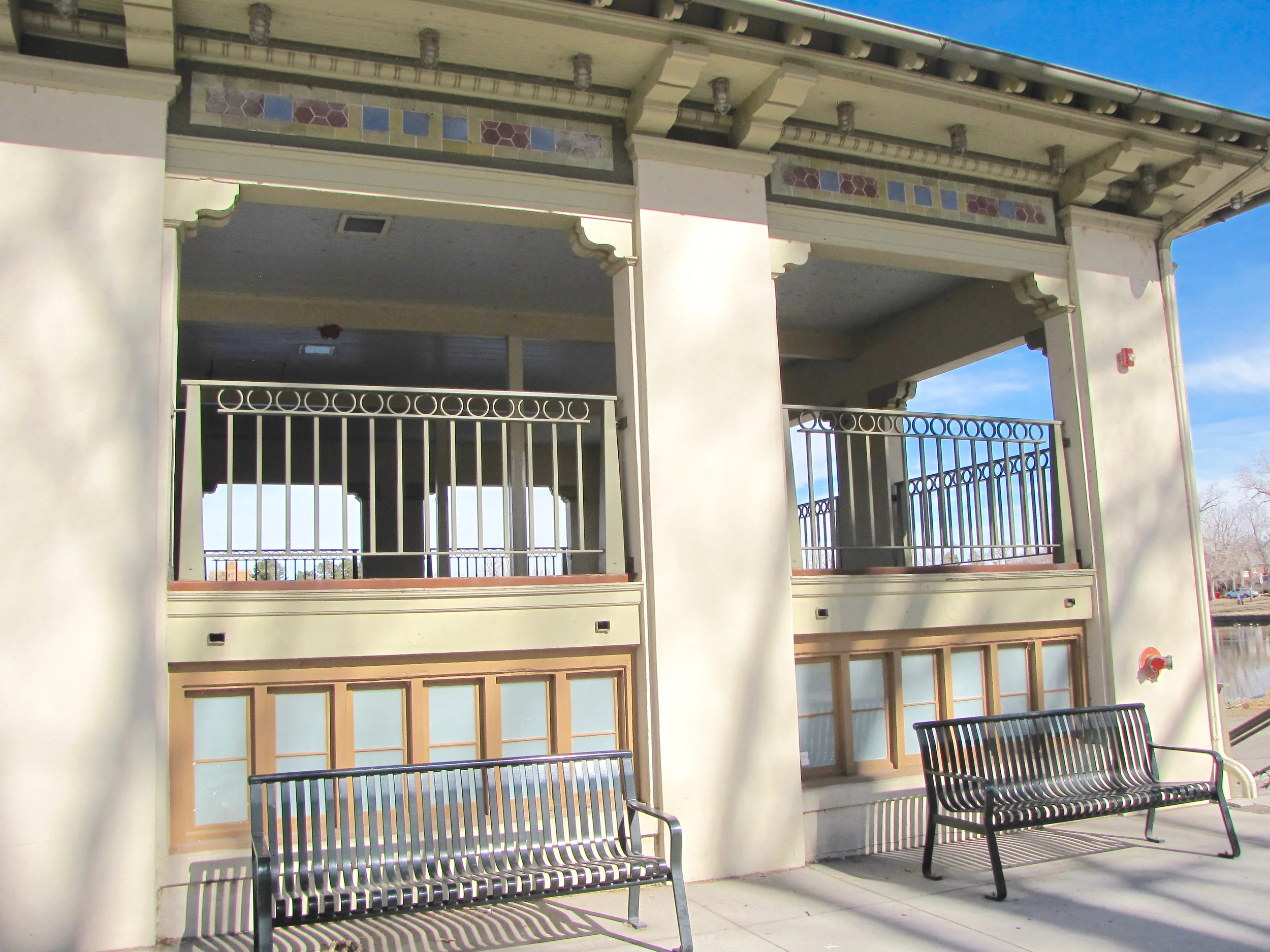
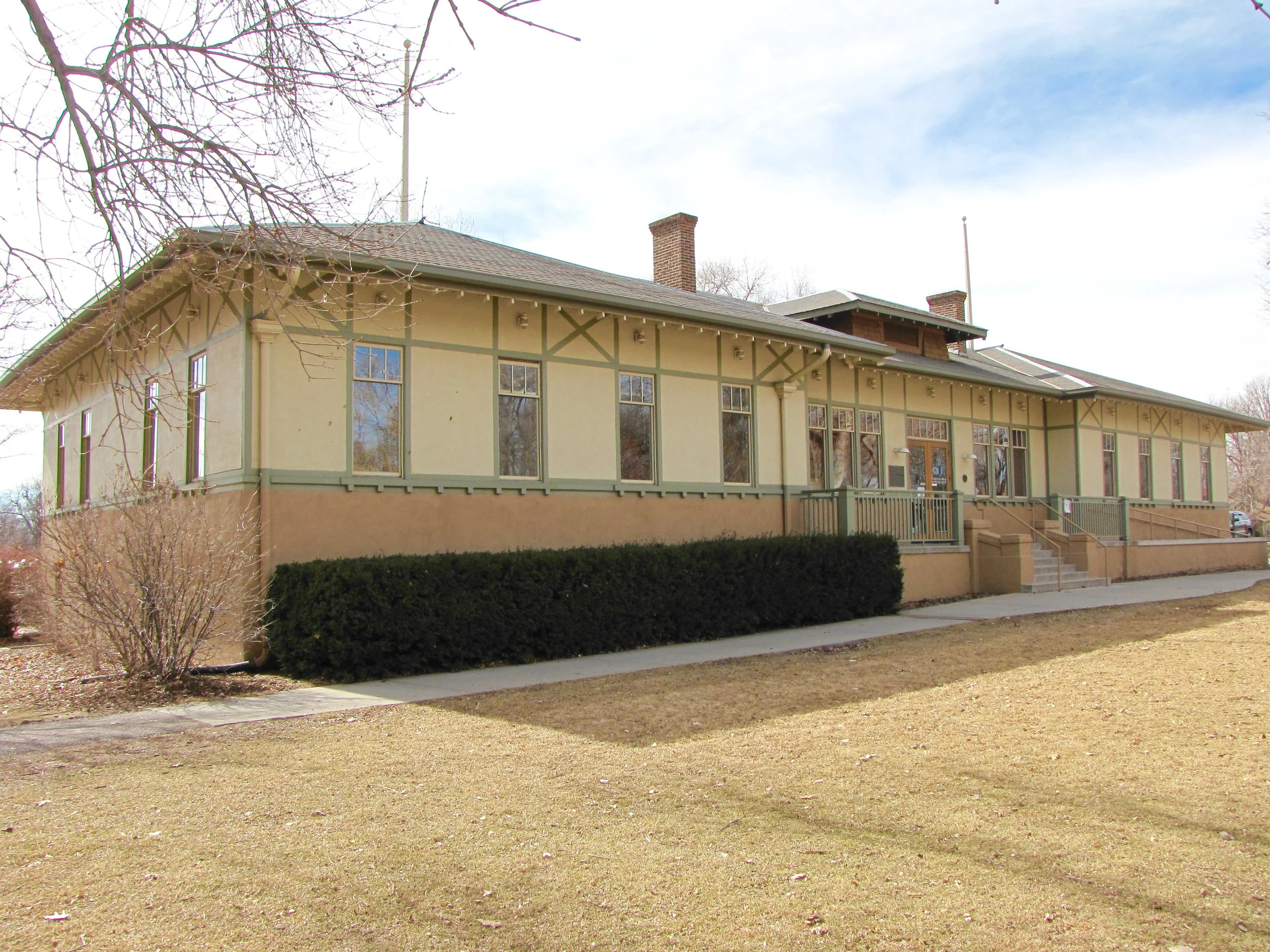
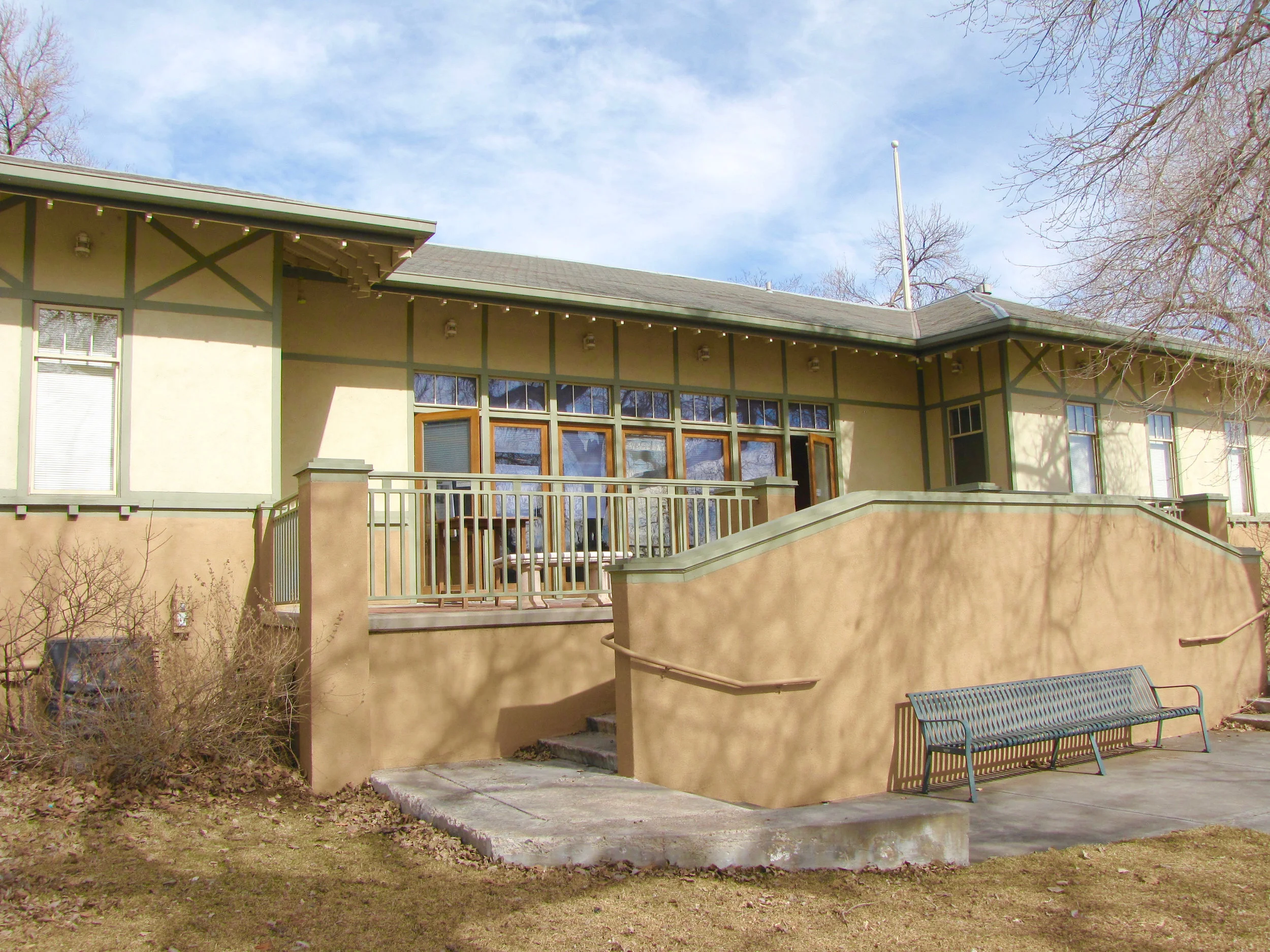
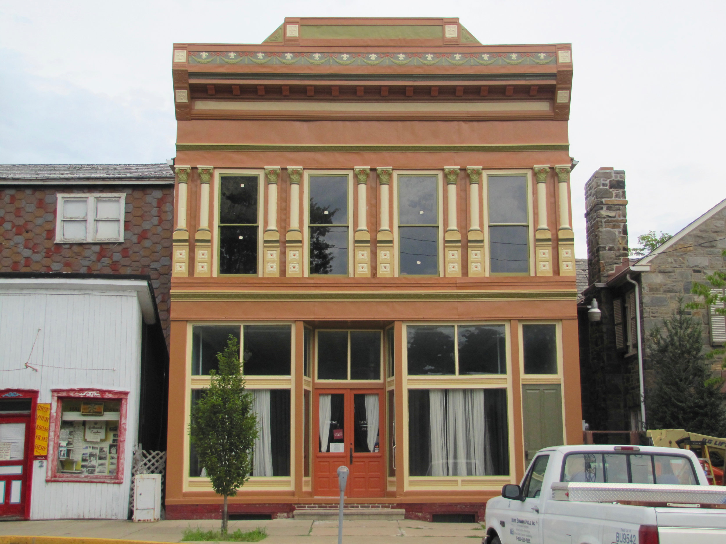
Much of what has been lost in our aesthetic is due in part to an unwillingness to investigate our past. There is so much grace and beauty in the simple yet powerful use of proportion. The architects and designers of the Victorian era seemed to carry this innate sense of balance and proportion throughout their work in ways we no longer pay attention to in many cases. This example highlights the value of not only being educated in the history of our arts but also being conscious of our design decisions moving forward.

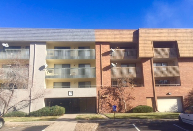
We have the right and privilege to design, build and shape our future. We therefore must also work to preserve, advocate and educate—the three pillars to sustaining and strengthening our communities, as Historic Denver promotes in their mission statement. We have been a part of this local organization for many years. We are included in their resource list of trusted and qualified tradespeople helping others to preserve and sustain valuable buildings around Denver. 

Another equally important resource to our city is Discover Denver who has partnered with Historic Denver in helping to identify buildings that are significant historically, architecturally and culturally. They are building a citywide survey that will help tell Denver's story. We believe this to be a very worthy cause and we appreciate everyone involved in these efforts. The Color People has provided architectural color consulting services for many of these important buildings and we continue to be involved in designing exterior color schemes for historic spaces all over the city of Denver, the state of Colorado and many other states nationwide.  

Rendering

Rendering

Most of our clients—both residential and commercial—tell us that their biggest challenge is visualizing a new color scheme working on their building. A tool we sometimes use toward easing this struggle is rendering. We would render all day long if we could but ultimately it can truly be more deceptive than helpful for some.

Our work requires us to imagine a home, a building or an whole community and all of its parts and pieces in a different light. We envision a project with an entirely new look and appeal. We consider the architecture, the market, trends and of course, the customer. Most of the time our creative process includes some form of rendering—whether we are looking at actual colors or simply planning in black and white where a contrast or variation in colors should occur. Some renderings could be loosely sketched while other buildings are better shaped and illustrated using computer programs.

We are certainly aware that many of us are visual learners and can relate better to an image when processing a new idea. Some people never even look at a picture or plan and rely solely on verbal descriptions. We employ many practices in communicating with our clients. There are times when it makes total sense to present a detailed rendering of a building. And there are other times when providing a plan for the new scheme and a folder of paint swatches is appropriate. But in each case there is a most crucial piece to the equation—in achieving the best results in visualization or understanding—and that is SAMPLING. We can not stress enough how important it is to sample the actual colors on the actual building. The factors that shape your perception of a color scheme are great—from light and time of day to the scale of which those colors exist. Therefore seeing colors on a computer drawing could create a very different experience for someone versus seeing it live and in person on a structure right in front of them. We always encourage and specify the LIVE version and go into great detail about how to do this in the most effective way possible.

Like I said, we would love to sketch and paint and render all day long but we want our homeowners, business owners and apartment community managers to get the most out of what we have designed for them—and to be able to successfully visualize what kind of impact it will make on their building. In the example we provide below there was a computer rendering done with great attempts at getting as close as possible to what the new color scheme would look like on the building. It is always an approximation of course and even with the best technology there are challenges in representing the existing and updated materials and finishes. I think the rendering does a fair job but looking at the actual paint job you can tell that the computer version lacked some of the subtleties and nuances of the design. Renderings are meant to assist and complement the presentations of our designs but in the end we trust that our ideas and work will be seen in the best and truest light (the light of day!).  

Providing Resources to Homeowners

Providing Resources to Homeowners

The Color People is one of the longest standing and most trusted resources for the premier publication for homeowners and historians alike—Old House Journal. We have been recognized in numerous articles over the years and called on by readers on a consistent basis.

The Color People has been a regular resource for the magazine's list of products and services valuable to homeowners, builders, architects and historians. Now we are proud to have been included in the Old House Journal Online Product Information Resource. Take a look in the Professional Services and Contracting category and make the most of a wealth of knowledge and experience in the field of design.

Working Together

Working Together

Like many historic neighborhoods across America, older neighborhoods are seeing an influx of new architecture—most of which are architectural styles divergent from what currently exists. The challenge is to make the old work with the new and vice versa. When choosing a body color, it is important to take note of the surrounding houses. If they are light you do not want to use a color darker than a mid-value, as it will look out of place and stand out like a sore thumb. You can also pick up similar tones from a nearby property to give a nod to new construction, such as using wood tones from a new apartment building. You can highlight the differing construction materials using subtle details and colors. You want the new colors of a house to make it feel right at home—nestled between the past and the future, working beautifully with both.

Apartment Homes

Apartment Homes

The operative terminology in the building industry today is apartment HOMES. In today's stressed out world people are seeking a home—a place that provides them with a sense of relief and a place to refresh and renew themselves. For this reason it is important that your community feel comfortable. The key to this is to use warm colors and colors that relate to the surroundings and the materials used in your building materials, like the brick and stone.  

Color Trends for Buildings

Color Trends for Buildings

No one wants a "trendy" building. Never the less, there are trends in building color that are distinct and make a marketing difference. Granted these color trend changes are not rapid, coming slowly and staying for a long while. But the difference of being on trend or off trend is simple. If you select colors for a building at the end of a trend your building will look nice at first when it is new. Then it will start to look tired. And in about three years, all of a sudden it will look ten years old. "Oh yeah, I remember that look—it was 2005 wasn't it?"

In many cases this will not be overly important. But if you are involved in retail or going up against brand new, cutting-edge multi-family properties you had better get it right. This is especially important if you are doing a face-lift or rehab. You can—if you get the colors right—look just as fresh and up to date as the new property you are having to compete with.

TODAY'S TWO BIGGEST TRENDS

COLOR BLOCKING    This is something which has been around awhile but has now firmly taken hold and will continue for quite some time to come. It basically is the breaking up of the facade of a building into various sections of color or materials like siding, paneling, brick, stucco, metal or the like. This can be done by emphasizing sections of materials or creating new sections with color use and placement.

This use of color is particularly good at breaking up long facades into more digestible sections so that the building no longer feels like a "complex." The selection of colors can be tailored to the segment of the market you are appealing to. Subtle colors for a more sedate tenancy—brighter for a younger market.

COLOR TRENDS    For the last ten to fifteen years the market has been driven by architectural styles that are based on historic models and so the colors used have been basically Arts and Crafts era colors, ones that are natural or earth toned and basically khaki-based. This era is over.

The new era references what is known as the Mid Century Modern Revival—architecture, furnishings and colors which refer back to the so-called "Modernism" of the late Fifties and early Sixties of last century. These colors are cleaner and stronger than the departing earth tones. The over-riding change now is to colors that are basically gray based. Blacks, reds and other bold colors are now popular. Colors with stronger contrasts in values are IN and softly blended colors are OUT.

How long will this remain popular? It is a fair guess to say a good ten years. This means that because the paint job you put on your building is usually going to last for a decade it makes clear sense to tune into these trends now so that your buildings don't look like they are from the last era and hamper your marketing efforts for years to come.

Exterior Decoration: Victorian Colors for Victorian Houses

Exterior Decoration: Victorian Colors for Victorian Houses

We are sharing with you one of our most beloved books. It has a special place on our inspiration shelf and if you want to add something to your holiday wish list, this would be the one. I will warn you though that it is not an easy one to find, which makes it even more unique.

Exterior Decoration: Victorian Colors for Victorian Houses is a marvelous collection of illustrations and actual color chips. It shares a great deal of information on the art of house painting and the selection and combination of colors. The detailed plates show Victorian architecture and aligns many styles with paint palettes consistent with the time. It is beautifully done and gives great insight into this important era and also how many of our colors of today have been shaped through history. 

COLOR WORDS TO LIVE BY

COLOR WORDS TO LIVE BY

Color Words To Live By:

There is not a single product that color does not impact the purchasing position of.

Historic Preservation

Historic Preservation

As champions of historic preservation we work with clients to not only maintain historic architecture but to also revitalize it and make it more marketable to business owners and homeowners alike. We appreciate seeing similar efforts amongst other designers, architects and developers and we are excited by the growing sensibility to this cause all over the country.

This is a great article ("CityLove" by Lauren Walser in Preservation Magazine) highlighting some of the ideas supporting preservation and showing just how three U.S. cities have been made richer and more alive than ever by understanding the power of historic places.

Creating a better painter/designer dialogue

Creating a better painter/designer dialogue

This is an article we wrote awhile back that we continue to learn from and refer our clients to. In it we discuss how our consulting practices and unique system of communication lead directly to a more enjoyable relationship between homeowner, designer and painter and a much more successful experience overall.